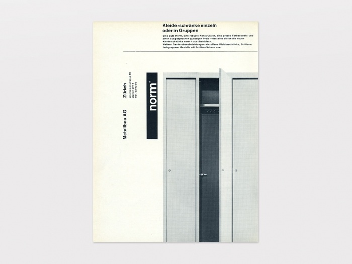
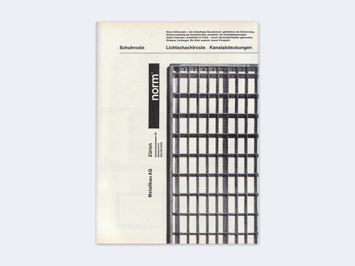
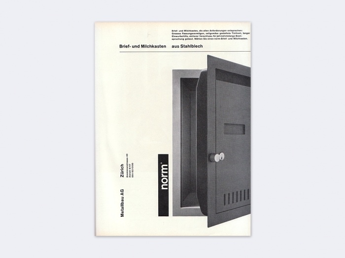
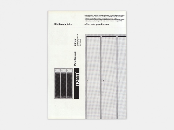
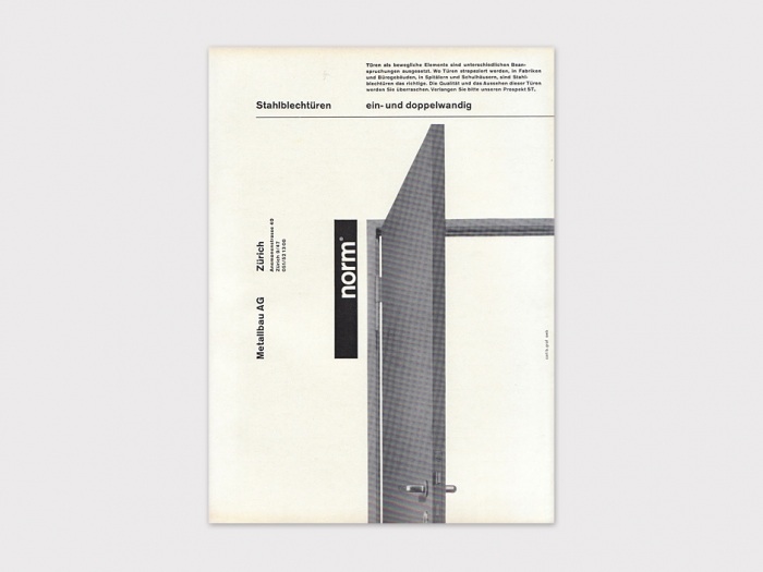
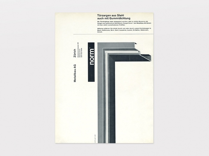
What I really enjoy and appreciate about these designs by Carl Bernard for Norm Türzargen is the consistency and simplicity created by the typographic restraint and adherence to a well established grid. Each piece is very consistent in form and typographical hierarchy, and all work together as a strong and established informational system. By employing a strict grid, sans-serif typeface(s) and monotone images it is clear that there is a strong International Style influence. Furthermore, each piece does very well to communicate a lot by minimal means in a very functional and clear manner.
Heads up We’re doing some major updates on the Lost Type blog, and this post is pretty old. If you think you see a mistake, please report it here! Thanks.

