This morning we are proud to introduce Mr. James T. Edmondson’s third contribution to Lost Type, and man… it’s a beast. A script font in three weights, Lavanderia is an enormously complex font, with hundreds of ligatures and numerous opentype features. James was kind enough to jot down the history of the font, take it away James!
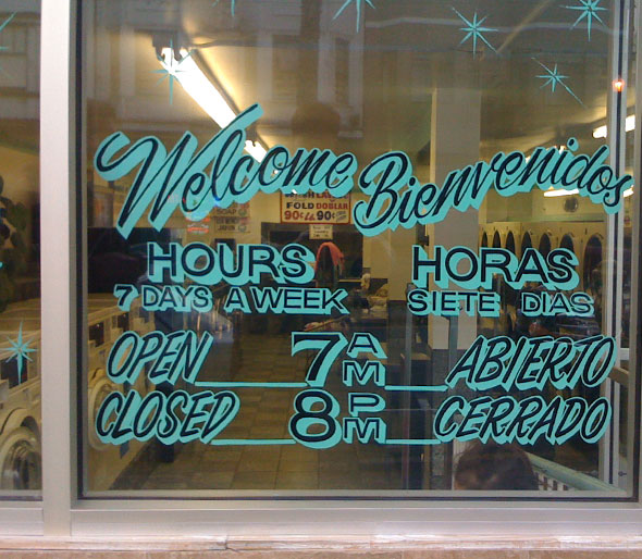
I’ve always thought of laundromats as some of the saddest places in the world, but after spending a lot of time in them since moving to San Francisco four years ago, I’ve found they have two things going for them:
- They smell great, and
- There is the occasional bit of dope lettering.

Laundry is an incredibly tedious task—the antithesis of glamour, so I have massive appreciation for the guy that decided to letter the window with a script that captures all the essence of what a laundromat lacks. Excitement, passion, love. It’s all in that script.
How nice it is to create something beautiful, where boring, stagnant lettering would have easily sufficed! My latest typeface Lavanderia is a celebration and a tribute to the enthusiasm that influences those who go above and beyond to create beauty where there is none.
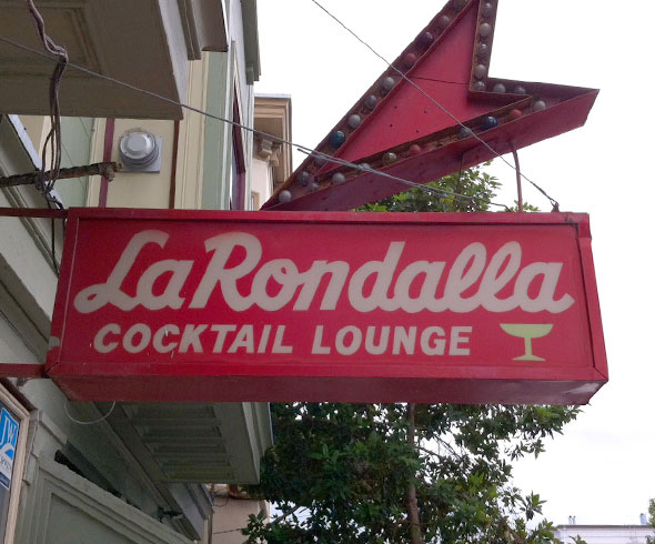
Inspiration came for San Francisco’s Mission District, a vibrant and at times foul smelling part of town, rich with dive bars, taquerias, and unemployed twenty-somethings who look extremely creative but actually do very little. It’s a magical place.

The Mission is famous for it’s signage. Even after living in the city for years, I’m still finding amazing things I haven’t seen before, from charmingly amaturish painted letterforms, to expertly crafted gold leaf.

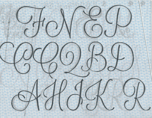
What I wanted to bring Lavanderia was the same energy, enthusiasm, and variety evident in all these works. I wanted to maintain close attention to detail, while letting the type get crazy at times. I wanted it to be useful in a lot of applications, and for many different moods. I turned to opentype to let the skeleton of the typeface remain the same while playing with certain variables.
Titling alternates take the capitals way down to a size and shape designed to blend in more with the lowercase, rather than shout from the proverbial mountain tops.

Stylistic alternates provide simpler forms (no loops on top) for the lowercase b, h, f, l, and k. Simpler forms can work better in certain situations.

Contextual alternates on the e, k, r, a, and y provide elaborate finishes for a hand drawn feel.

In a similar fashion, swashes on the p, y, g, j, d, n, m, l, and t make a party out of descenders, ascenders, or crossbars. But don’t overdo it like I did here. See how nasty that looks?

I’ve enjoyed working on Lavanderia immensely, nonetheless I’m happy to be moving on to other type projects as this has been eating up a good amount of time! The fonts are not perfect, and if you spot any bugs, please let me know so we can update the files. It’s difficult to test fonts thoroughly. That is something I am working on. Please let me know (via twitter or email) if you use Lavanderia on anything, I’d be thrilled to see it!