Looking back on each trip we’ve embarked on, the highlights definitely include the archives we’ve had a chance to visit. Although the Letterform Archive was not open when we all flew to SF in 2012, it is now open by appointment, which means that every single city we have visited on all 4 trips thus far have had an incredible archive of typographic material. In fact each one is unique and special in its own way, and that has kept us traveling.
In New York City, Frances arranged for us to visit the Lubalin Study Center Archive, where we were shown some of New York’s most prized typographical treasures by Sasha Tochilovsky. We sat down at a large table and he stood for 2 hours, describing each of the pieces he had pulled specifically for us, in detail. He is also an instructor at Type@Cooper, and he’s one of the people doing the most for type design education in the USA at the moment.
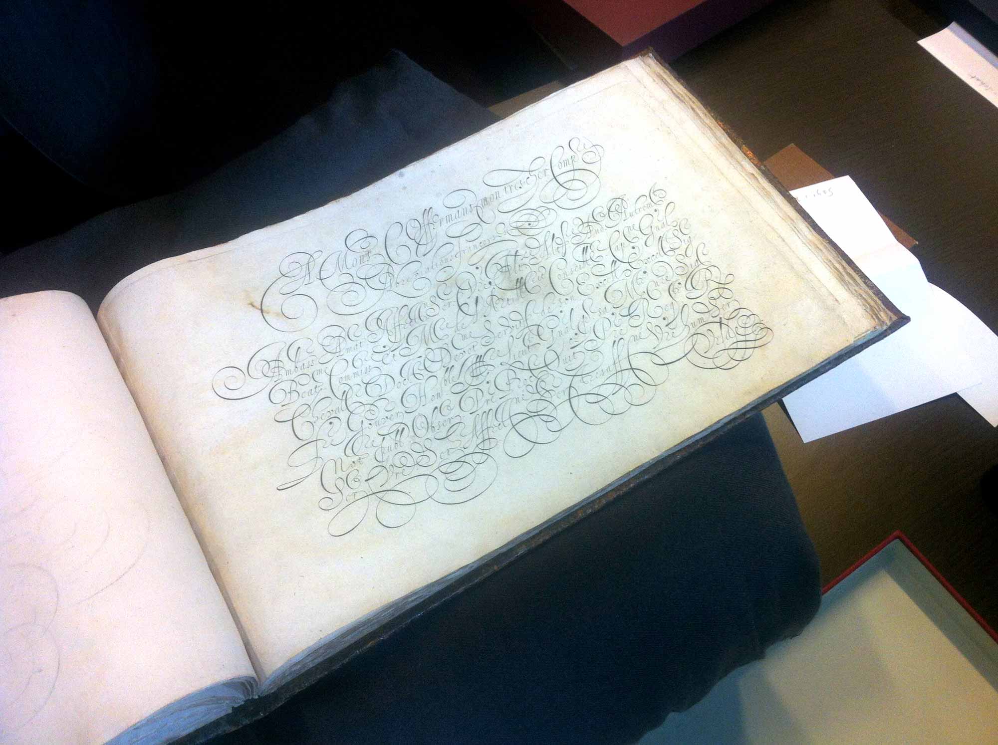
In 2014 we were able to visit the Bijzondere Collecties at the University of Amsterdam Special Collections, which is an incredible archive of historical calligraphy (going back 400 years) and a wonderful record of Dutch typography (including some of Bram de Does original drawings of Lexicon, amongst other things). Mathieu Lommen showed us through the pieces, handling each one with extreme care, often using gloves.
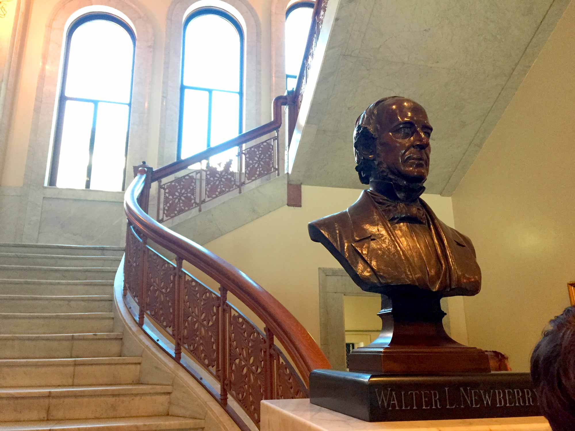
And this year we spent an incredible afternoon at The Newberry library, a privately funded library established in 1887 when a secondary clause Walter Loomis Newberry’s will stipulated that under specific circumstances his fortune was to be used to build a free public library. Establishing a fascinating goal of collecting material based entirely around the printed page, the alphabet and the letterform arts, The Newberry has since grown to be one of America’s finest collections of typographical material, now housed in an additional wing from the 1980s which is climate controlled and fireproof.
Exactly the right moment
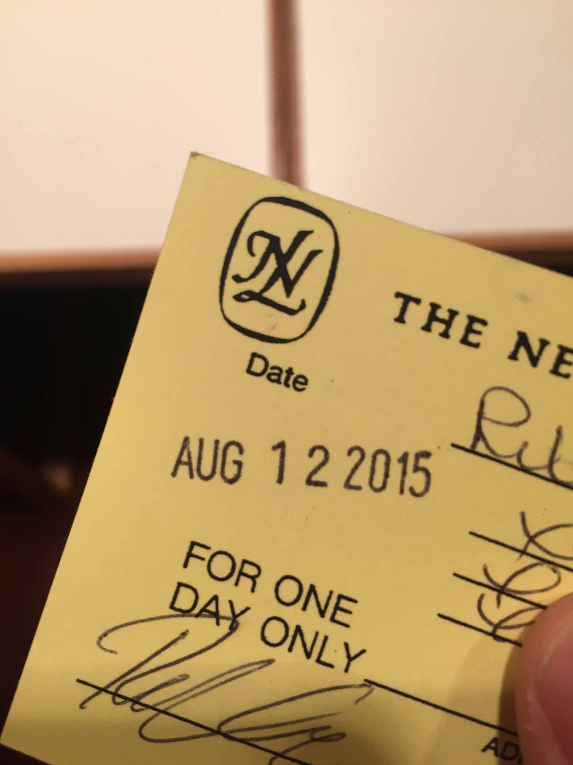
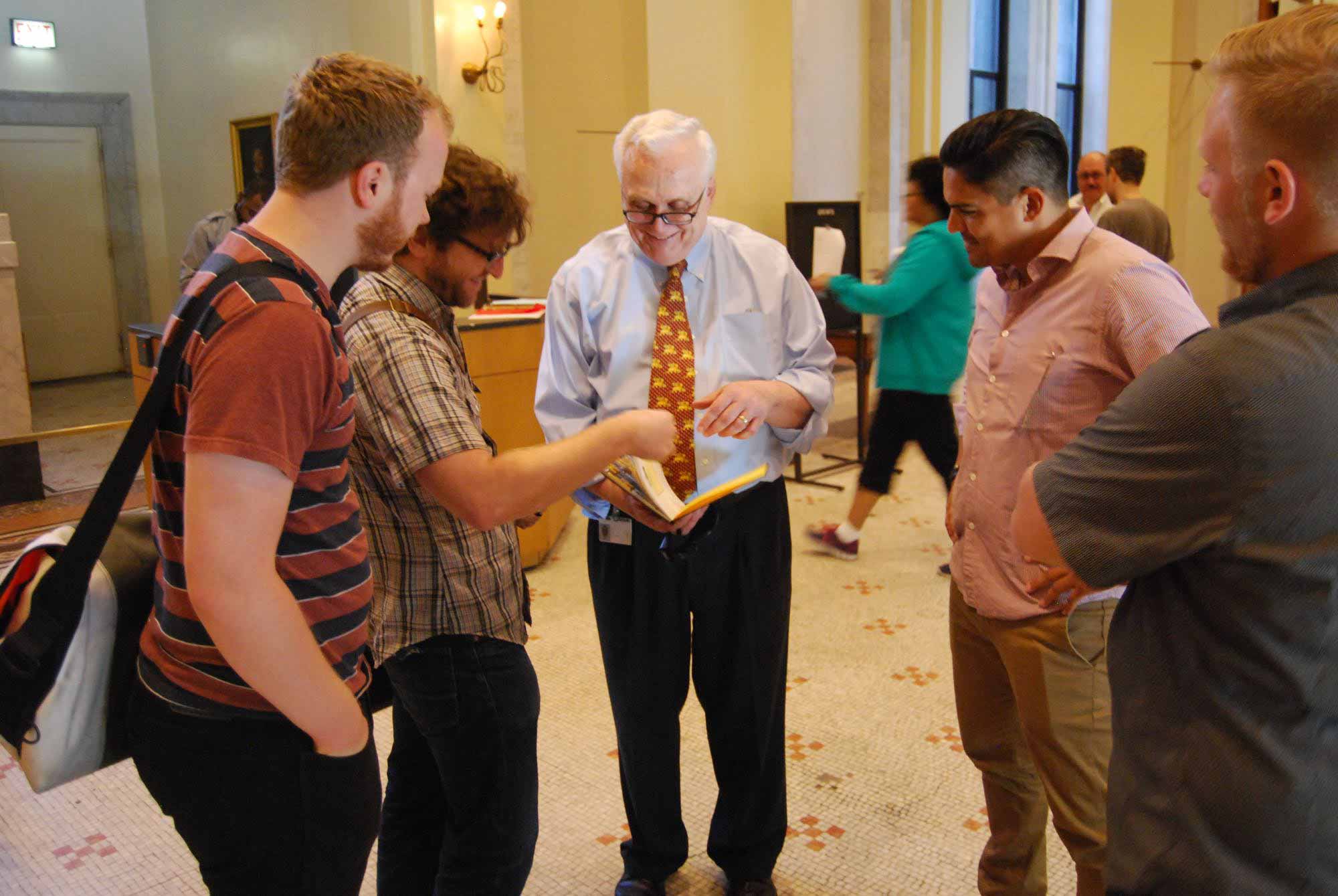
Paul Gehl has been curating the typography collection of The Newberry library for over 25 years. When he informed us that he will be retiring next year, I couldn’t help but feel that we had arrived in the 128 year old building at exactly the right moment. He expressed how rare it was to get people in the archive who actually specialize in type and lettering, and how excited he was to show us the material he knew we would appreciate. Everyone signed in and received a reading card for the day, which I still keep in my wallet, purely for the fond memories of how we spent the following hours that day.
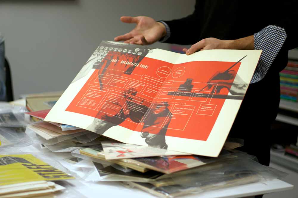
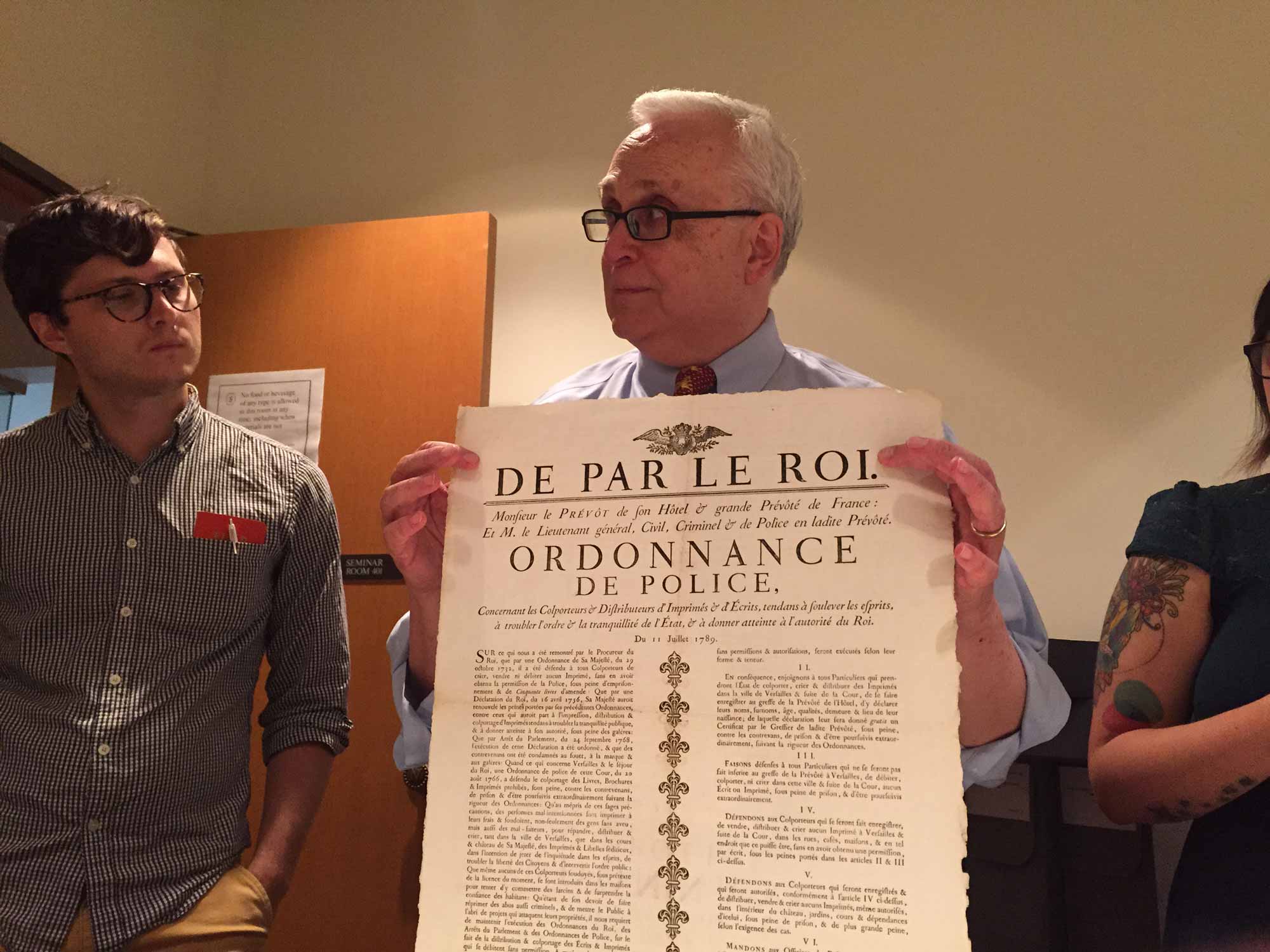
Spencer led the charge on us being there, and I’m very thankful that he did. He had called ahead and asked to see a variety of specific pieces, and we were led to a long reading table filled with treasures including a phototype disk, a book of illustrations that includes the work of Danelle’s great uncle (more on this later, just you wait) and a book of chromatic wood type specimens (layered typefaces from the turn of the century).
Kenneth and I used their computer system to request specific items from the catalog. When I asked Paul if we could see the Oz Cooper original drawings (which I had heard rumblings of even before arriving in Chicago) he called up the computer record and informed us that they take up 9 linear feet, and that he was going to request the first 3 boxes purely for space reasons. Oz Cooper is a legend of both lettering and type design, and his classic Cooper Black was released in the 20s, and later saw a resurgence of popularity in mid century advertising.
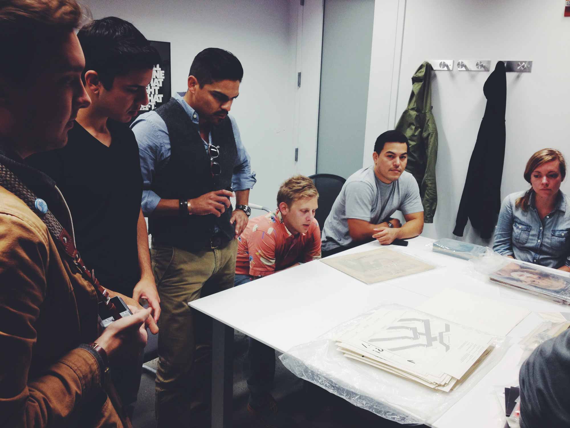
The reading room
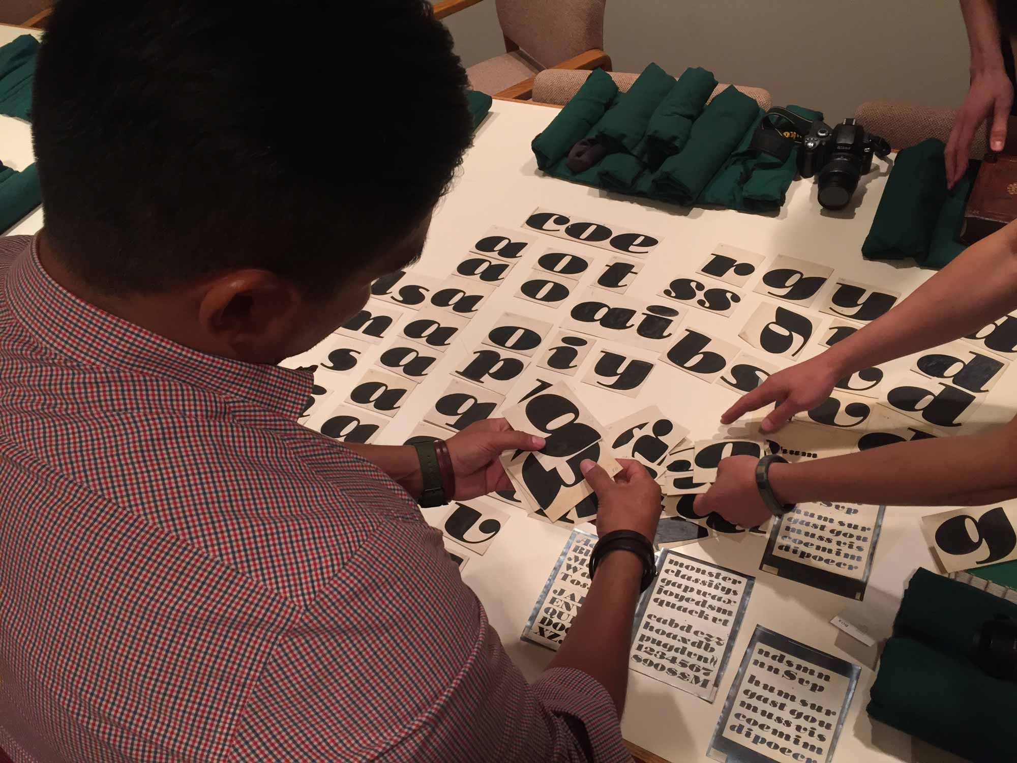
When I arrived back in the reading room, the Field Trip crew were already pouring through folders of his original sketches, inked drawings and in-progress proofs. We saw original drawings for Cooper Black and Cooper Fullface, which included variations on many glyphs, markings for corrections, and other wonderful details.
This made me blurt out This is fucking rad.
I felt silly swearing in the context of a quiet reading room, but I looked over and Paul was chuckling to himself, he added That’s a technical term right?
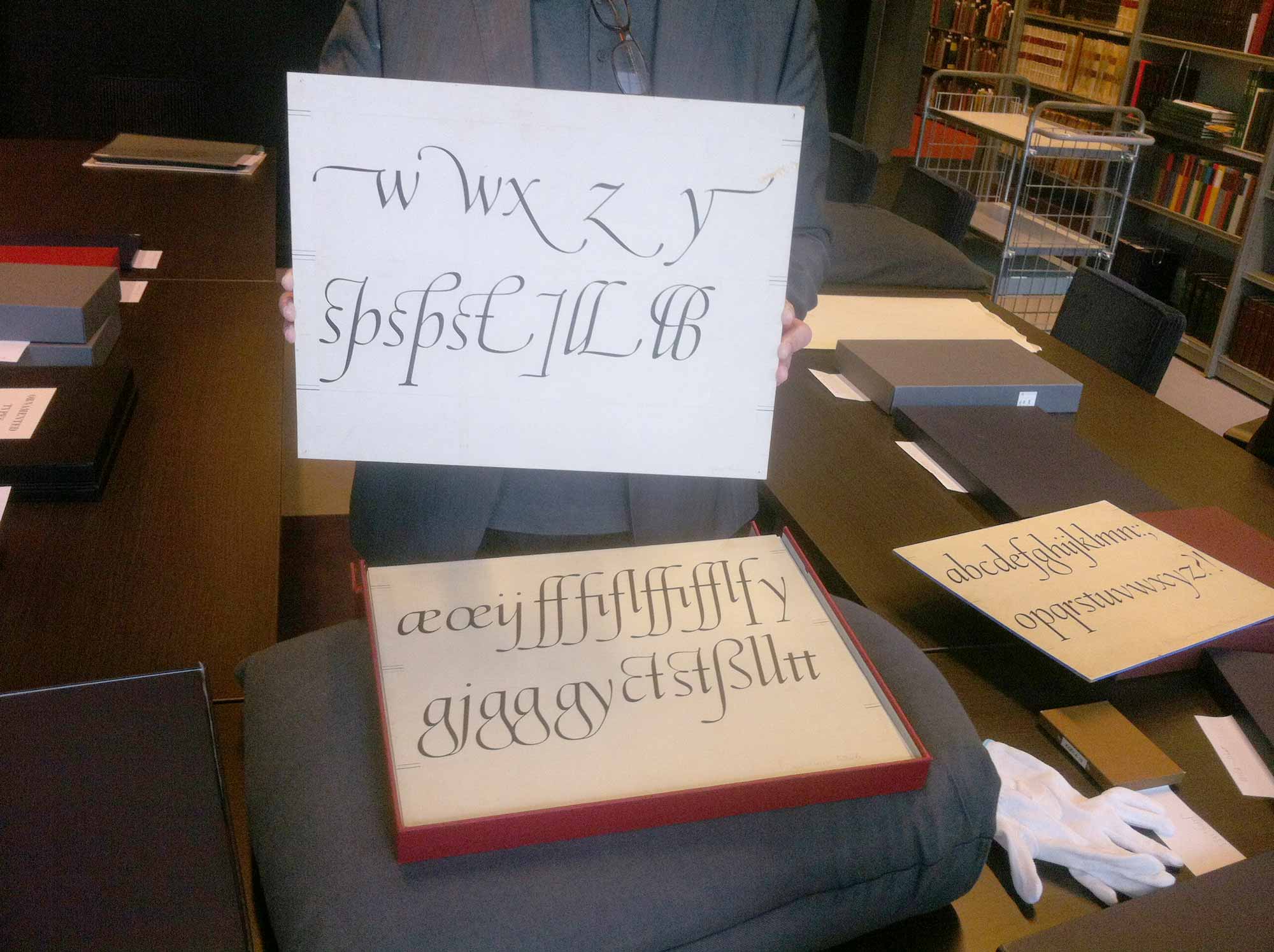
It was amazing to see the streaks of black ink on the individual cardboard squares, let alone to have a moment where you could clearly see he was headed in the wrong direction. To me that was one of the most humbling moments, to see a historical record of someone… making a mistake. In all of the archives we have visited, traveling the world for years to source this sort of inspiration and research, I don’t think I have ever seen a single example of an archived mistake. It made me feel like giving myself a break when it came to my own discarded drawings and slips of the pen.
As we left the archive that day (all of us crying and being dragged out by our feet), we presented Paul with a specimen book of Dan Gneiding’s Dude, which has spreads by various designers from around the world. Dan had been carrying one in his bag for such an occasion, and he wrote Paul’s name on the This specimen belongs to:
line on the title page.
Paul took it and thumbed through the pages, adding I will prioritize this for cataloging.
Although these archives are incredible for what they contain, the people who curate them and showed us around are often what made the experience truly great. We are immensely thankful to Paul, Mattheui and Sasha for showing us through the amazing archives they curate, if only a small portion of them.
What we saw inspired many letterforms of our own, some of which will be released in commercial typefaces shortly. If you get a chance to visit any of these locations, do not miss it. I hope you enjoy them as much as we did!
- Letterform Archive in San Francisco
- Lubalin Study Center Archive in New York
- The Bijzondere Collecties in Amsterdam
- The Newberry library in Chicago