To celebrate our turning 3 years old here at Lost Type, we did some of our favorite things – we released some fonts and put out some new merchandise.
To announce the addition of the Hank Pro family to Dan Gneiding’s monster Dude collection (which now comprises over 15 fonts) we also worked with some of our favorite lettering artists, illustrators and animators on a small piece of promotional material that we came to really enjoy working on.
Although I watched 4 separate people around the world send in progress and work for hours on this particular piece, its ultimate form is a 10 second animation that appears on our homepage. Below are some details about how it was made, and who was involved.
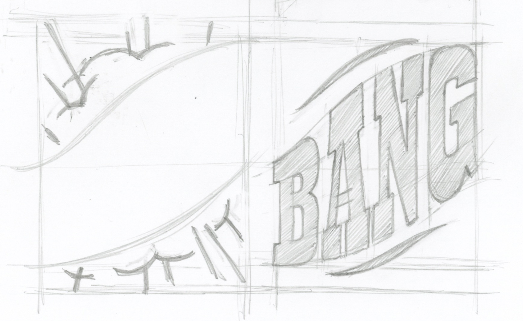
It began with lettering artist Matthew Tapia, who sketched the Bang catchword for Hank Pro from his office in Hawaii, using a 2H pencil. He then vectorized the lettering and it was included in the catchwords font in Hank Pro, along with many others (that I will be blogging about soon).
Next, Dan Gneiding and I decided that Hank Pro should also include a series of glyphs called Manicules, also known as an indexes, to fit with the cowboy-esque wild west theme that the reverse contrast style always gives off.
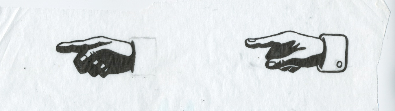
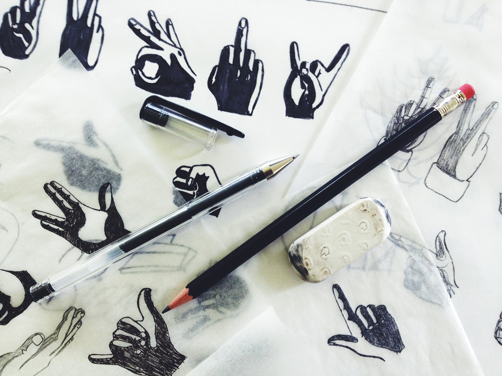
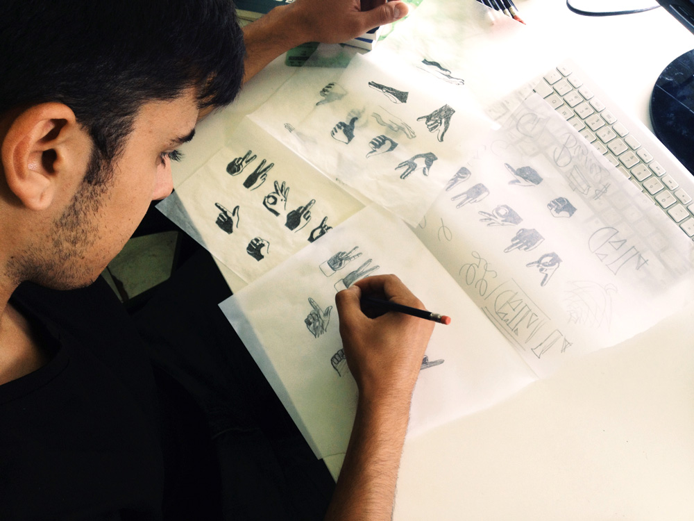
Next we enlisted my talented Cousin, designer and illustrator Cade Cran, to draw up a series which eventually totaled 14 drawings. He began by photographing my hand (I’m a hand model now) with a direct light source, and then sketching iterations, stylizing and revising as he went. These were eventually scanned and vectorized.
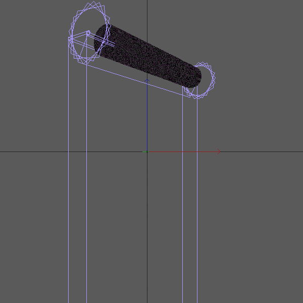
Then it was time to hand it over to our talented NYC-based friend Ian Sigmon, who brought the piece to life with motion using After Effects and Cinema 4D.