HISTORY
Mission Gothic began as a one weight, all-caps typeface during Field Trip SF—a trip to San Francisco with the Lost Type designers. As a group, we spent hours wandering the streets of the Mission neighborhood, known for its hand-painted signs. One of the many photographs we took was of a small hanging sign in the storefront of an optician on Valencia Street:
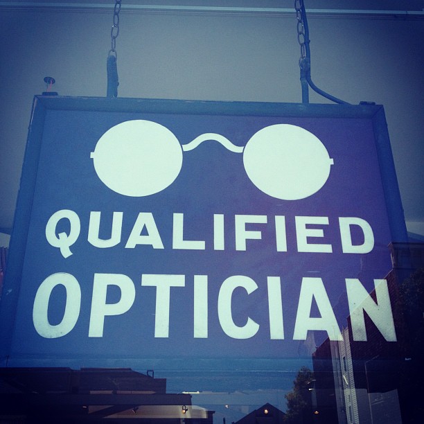
At first it seemed like a traditional 20th-century gothic, but upon closer inspection, we noticed the lovely irregularities and knew this could only have been painted by a human hand. We kept walking.
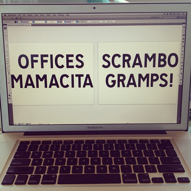
When we got back to our house that day, we began sifting through our photographs from the day, and turning our favorites into digital letterforms. An early attempt of what would eventually become Mission Gothic:
After realizing the extent of the rich typographic influences behind what we saw in the Mission, and seeing the potential of the first few characters we drew, we decided to turn those letters into a typeface, and eventually an entire family. After thorough consideration, we decided it would be best to at least add a lowercase, and then we started experimenting with other weights. Many months later, we have arrived at a complete Mission Gothic. Five weights with italics, to put a substantial amount of typographic control in the hands of the designer.
INFLUENCE
The forms are inspired mainly by antique signage in San Francisco’s Mission District, which were heavily influenced by signpainting manuals from the early to mid 1900s. The shapes evoke a sense of nostalgia, without being cartoony or overtly retro in feel.
DESIGN
The first typeface that came out of the Mission Collection from Lost Type was Mission Script, a brush script style typeface with a friendly signpainter vibe. The question became how best to compliment a script typeface with a gothic. What remains the same, and what should change? We settled on putting the Mission Gothic italics on the same twelve degree incline that Mission Script falls upon, so that when paring the fonts, they effortlessly compliment one another.
Mission Gothic is a low contrast sans serif, and is built mostly for display text. While Mission Gothic can be set small, it is intended for sizes larger than fourteen point, in order to let the nuances of this typeface shine.