During a recent visit to Kansas City, MO, I made a point to stop by the River Market Antique Mall. Riley Cran made the suggestion and said I wouldn’t regret it. He was right. As it turned out, the quick stop wasn’t so quick because of all the typographical gems that can be spotted with a discerning eye.
One of the finds was a 1954 Happy Day Outing Kit, made by Gotham Steel Co. during a time when family picnics and outings were the norm in America. Although the original cups, dishes, and utensils were missing from the play set, the metal box was intact with handle and clasps.
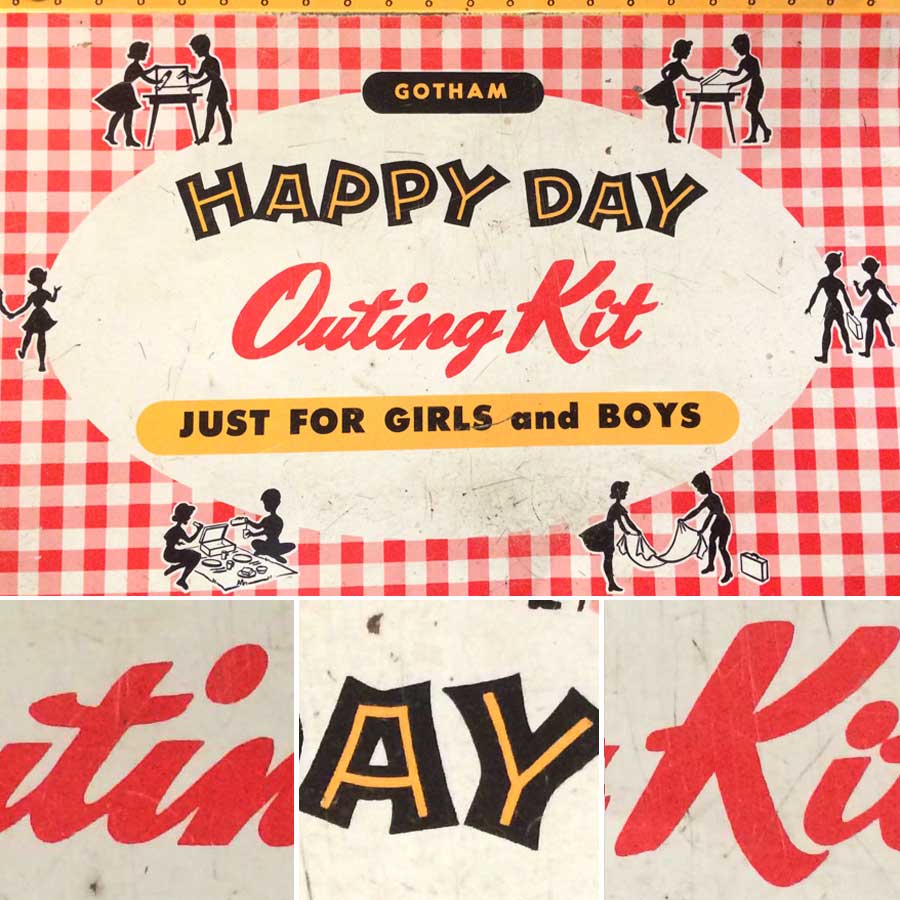
The playfulness of the inline type in high contrast yellow and black immediately drew my attention, as did the illustrations of silhouetted figures, which at first glance appeared to be black ants marching on a red picnic tablecloth. What really interested me, however, was the warmth and friendliness of the informal script. There is something quite charming about the subtle inconsistencies—such as spacing, the t crossbars, the dot placement of the lowercase i’s, and the broad strokes of the K—which give these letterforms personality and a welcoming appeal.
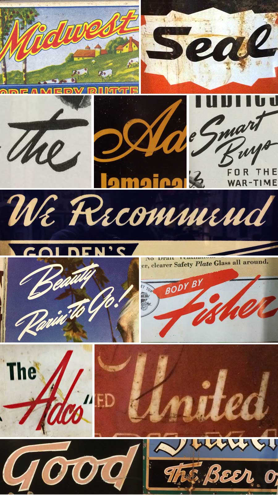
Casual brush script lettering popularized in advertisements and editorial headlines in the mid-twentieth century will always have an important place in the history of American typography, and it continues to be an ideal lettering style for a wide range of typographic applications today. I am always on the hunt for brush script lettering references. Here are a few other neat finds.