In the winter of 2015 I was contacted by Parc Masterson at the celebrated Kansas City ad agency Sullivan Higdon & Sink (SHS) about designing new custom fonts for SONIC® Drive-in. A beloved burger chain in America for 64 years, SONIC still retains a classic and at times nostalgic presence as a drive-in, while being decidedly modern with innovations like digital menu boards that play motion graphics when you pull up to make your order.
What they needed initially was a sans-serif that could serve in a very functional, hard-working capacity. It would be used in menu design, print advertising, motion graphics, and a variety of other uses. So it had to be flexible.
Advertising for a food-related company is an intense craft. It requires a lot of ever-changing campaigns and seasonally rotating motifs, short term deal-based advertising, introductions of new products, and a million other ideas to communicate. For a brand’s typography I think there’s an interesting line to walk, in those cases, between conveying one typographic voice and allowing for flexibility. What happens tomorrow when a new longer product name requires condensed fonts? What happens the week after that when the campaign needs to specifically NOT be what consumers saw the week before?
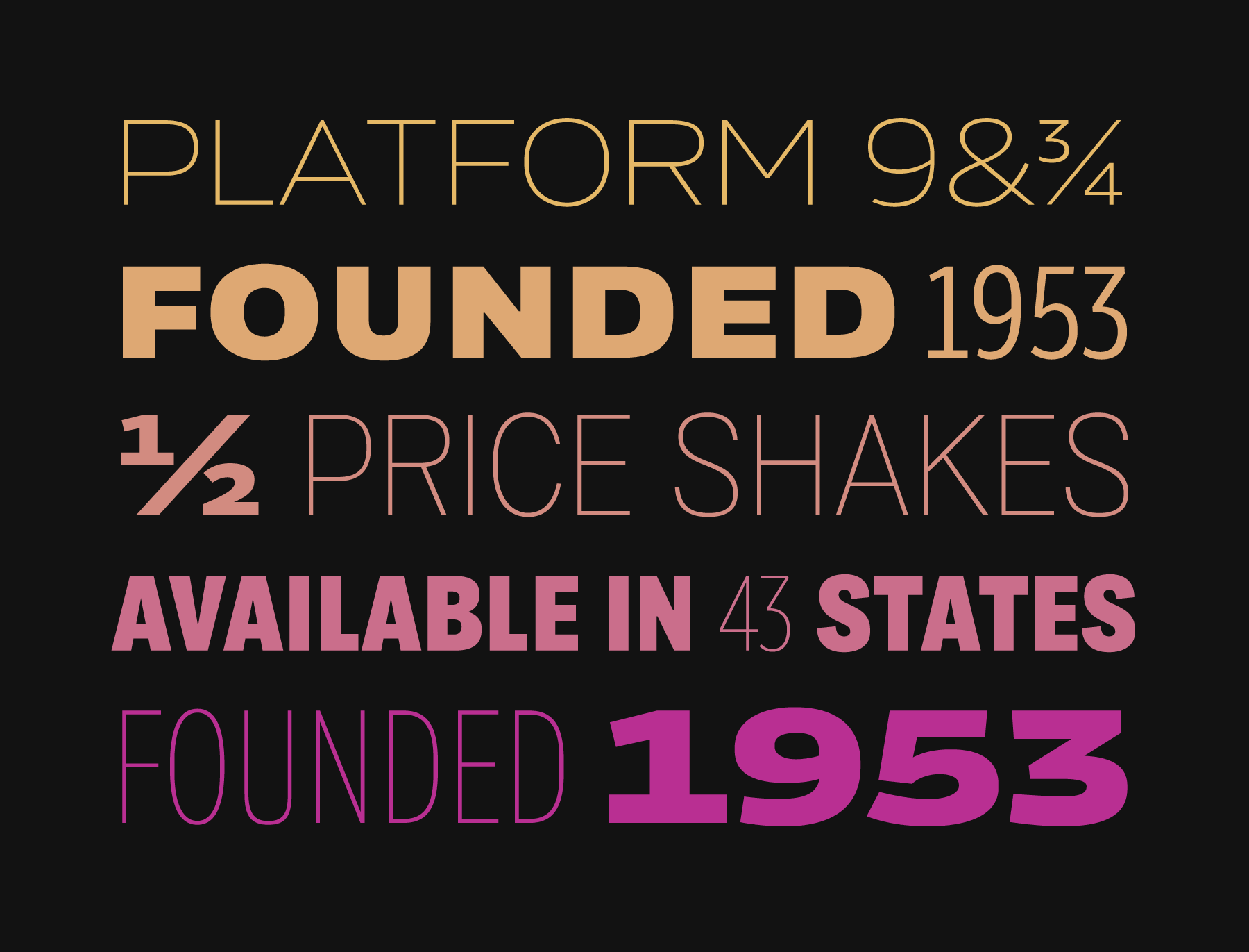
After discussing this sort of planning with the fine folks at SHS, we decided to embark on a project that would include a significantly wider scope of fonts than you’d typically find a company adopting. A sans-serif family was planned that covered a range of widths and weights, allowing for a nearly endless set of combinations that would always feel like SONIC, while remaining fresh and adaptable, just like the advertising it was made to function in.
Aesthetically SONIC’s communications had often drawn from the imagery of the great American highway. One of the main inspirations, in particular, was the idea of license plate typography, and this came up early in the process. Most fonts designed for license plates are designed in factories to be mass produced, or to be read by computers, and might for instance be something from the long running series of OCR (optical character recognition) fonts that include the fonts you see below bar-codes on groceries and library books. How do you train a computer to read a license plate from a car that is in motion? You draw the glyphs to be very disambiguated, and you give them details that are unmistakably unique to that glyph.
SONIC had actually used fonts that were strongly reminiscent of license plate typography in the past, and what we discussed was that in many cases the aspects of the OCR fonts designed to appeal to computers weren’t particularly ideal for human readers. There was often a lack of the pleasant rhythm that appeals to the human eye, in words and sentences set in these fonts, and SONIC’s typesetting needs had outgrown these fonts. There were however, various aesthetic details that we could look to in the typography of license plates, as inspiration for what was becoming SONIC Sans. The high waist of the capital ‘R’ and the symmetrical construction of the capital ‘M’, for instance, were qualities reminiscent of OCR fonts. License plates also tended to have ‘rounded’ sans letterforms, with subtle curves instead of sharp angles. After isolating these and many other details we were fond of, I started drafting a typeface that would marry these characteristics with something more ‘informational’ and hard working.
I drew inspiration from sans serifs of the early 20th century, often provided in metal-type in various unrelated fonts instead of one consistent type family. I wanted to find role models for a sans serif that felt more American, to serve as the typeface for a classic American burger joint. And in seeing all the disparate and unrelated widths and weights of these role model historical inspirations, it made me excited to think about joining these proportions into one large and flexible family of fonts, systematically and with care.
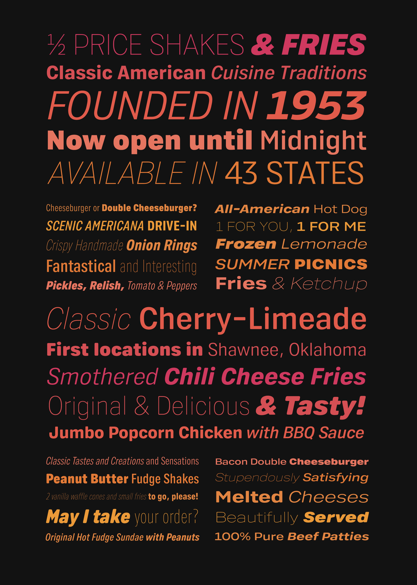
I drafted a set of extremes that ranged from a hairline ‘thin’ to a powerful ‘black’ weight, and from a quite narrow ‘condensed’ width to a sprawling ‘wide’ variation with a powerful stance. These extremes, and all of the relevant fonts that existed between them, created a family of styles that could be mixed and matched for a huge variety of pairings. The number of fonts in the family was growing high, but for good reason.
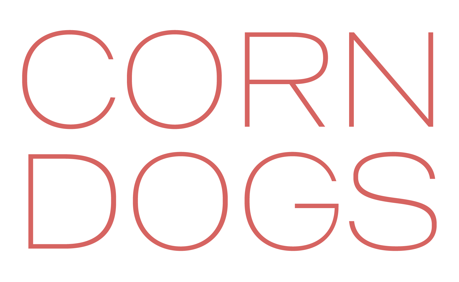
In typeface design strings like ‘Hamburgerfont’ are often used to test different groups of letters working together. In this case, these are the most literal Hamburger Fonts I’ve ever drawn.
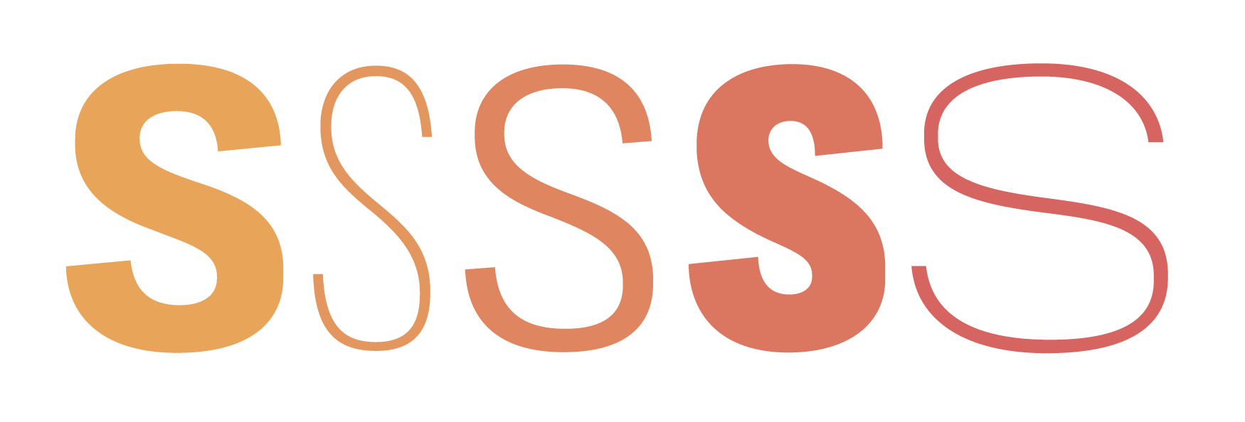
During the design process I realized I wanted a rounding effect that didn’t universally round all corners, but instead rounded corners selectively so that the fonts could convey the right rounded aesthetic tone, but also preserve the crispness of counter forms and any other glyph-by-glyph moments where the fidelity of the drawing shouldn’t be compromised by rounding. This avoids the fonts feeling ‘blurry’ instead of ‘charmingly rounded’. In doing so, I essentially set up a process where I was drawing without rounded corners, and adding them after the fact. Which of course led to the realization that non-rounded versions of the fonts would be possible to deliver. And so the scope increased again, for good reason.

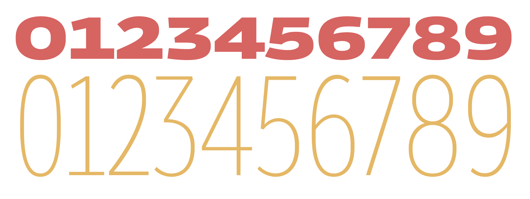
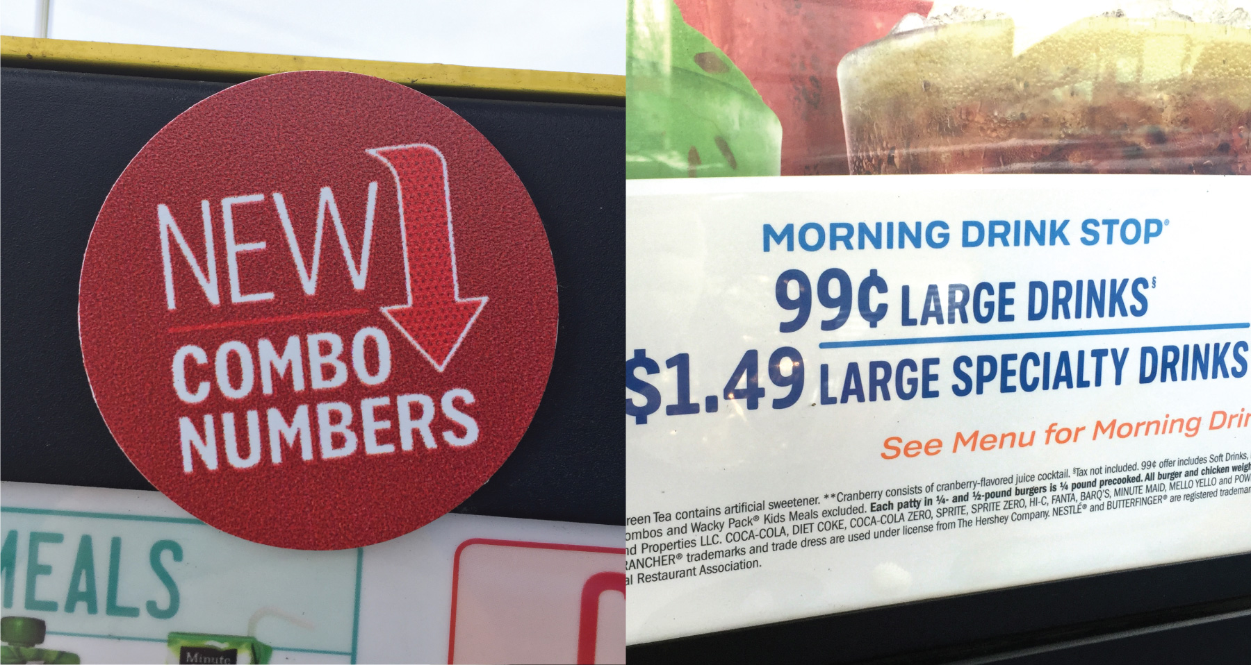
With the addition of italic versions of both the rounded and non-rounded versions of the fonts, the scope eventually rose to 60 fonts in total, comprising over 15,800 glyphs. I was even able to bring in some of the inspiration from license-plate typography into the SONIC Sans figures, providing a nice dose of disambiguation. Especially handy for setting lots of prices meant to be seen from a distance.
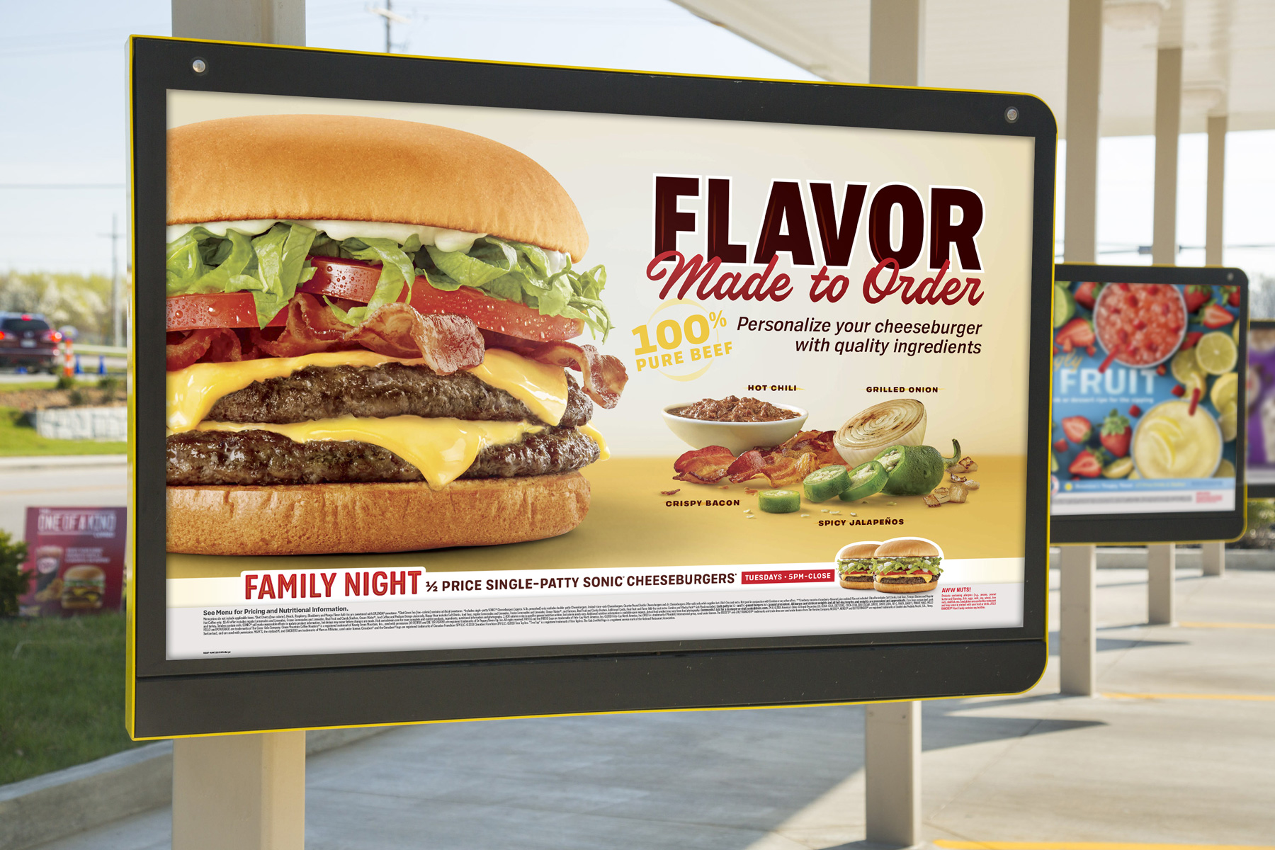
The talented designers at SHS quickly put the fonts to use, and it was a real thrill to see them start to pop up in advertising. I followed SONIC on Instagram, and started to see the letterforms I had drawn popping up on advertisements for tater tots and milkshakes. Each ad capturing the aesthetic of SONIC but with a new vibrance and flexibility to their typesetting options. The client wrote down some of their thoughts:
The Sonic fonts enhanced our capabilities to design with originality, without fear of what our competitors are doing. It allows us extreme flexibility as designers while knowing our designs are always on brand.
As designers and art directors we all have the same goal of making sure our clients are staying relevant, with that it makes it a challenge to help your client and their brand stand out. Partnering with Riley we were able to help direct the creation of a family of fonts that are unique to SONIC. We now have a foundation to stand on that will help build consistency across all platforms for SONIC and build brand equity.
When I visited Salt Lake city in the winter of 2016, I got out of the car in the freezing weather to go snap some photos with my phone of the menu, and bits of advertising on the building. You’re generally not supposed to leave your car when visiting a SONIC drive-in, that’s kind of the whole point. So I can only imagine what the staff thought of seeing me there through the window, with my (not snow friendly) shoes buried in the slushy snow, photographing a digital menu board from 3 inches away because I noticed they used the section symbol I had drawn.
I have very much enjoyed working with both SHS and SONIC, and they returned the following year to increase the selection of fonts for SONIC even further. I’ll be writing more about that story shortly.
Thanks to Jessica, Parc, Burke and Amanda for their support on this project. Mastering assistance on the fonts by PSY/OPS type-foundry.