Escafina is an upright script typeface that I drew from 2014-2016. It threw me a considerable number of challenges, and made me a better type designer. You can’t ask for much more than that from a project.

The idea for this typeface started from research I had been doing on vernacular vintage signage and sign painting. I had noticed that there were quite a few samples of ‘upright scripts’. Whereas most script lettering has an angle of slant, upright scripts are drawn at only a very slight angle, or are perfectly upright. They have a charming, a-typical presence in a design. They are just unusual enough that they stand out without being impractical and illegible. Their ultimate relation to both an italic and a roman makes them feel like a clever trick.
Even though there are countless wonderful and characterful examples of upright script lettering in signage and advertising, they are almost all just that: lettering drawn for a specific single purpose. There are very few actual typefaces in this genre, and the ones that do exist, upon further research, felt very unresolved. The lettering was rarely systematic enough to be a solid model for a random arrangement of letters (as is necessary in type). It seemed to me that this was a genre of lettering that had been lost to time, and deserved to be re-interpreted in the form of digital type.
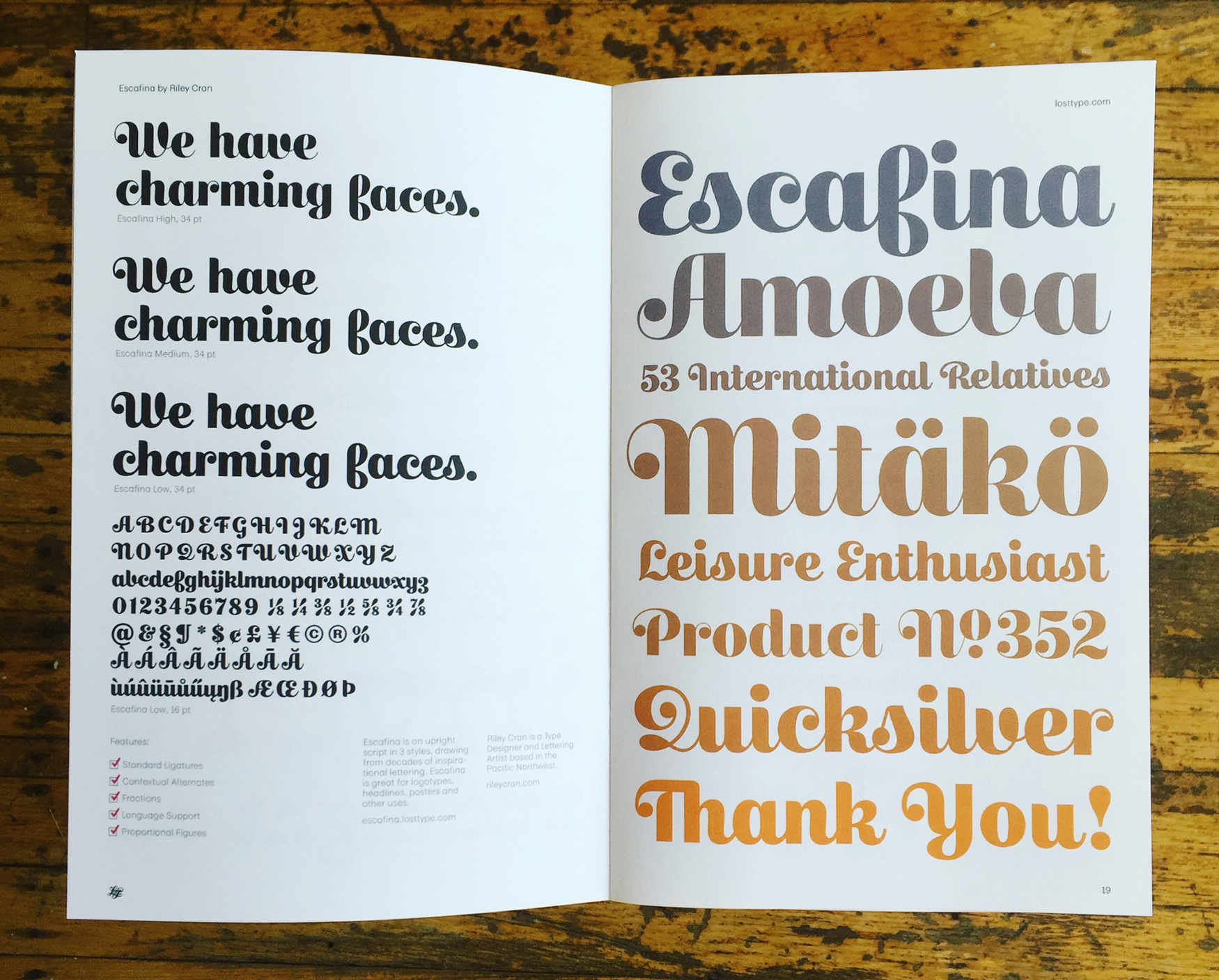
When I sat down to begin planning my own contribution to this genre, I found that a brief had just sort of appeared in the back of my mind somewhere after looking at so many historical samples. From my sketches, I seemed to know already that there were a core set of parameters that I was interested in designing around, specifically: Perfectly vertical letters (not even a slight angle of slant), a ‘structured’ construction with very rationalized forms (not especially calligraphic), a slight influence of the brush that could help to disambiguate the forms, and a goal of harmonizing the caps and lowercase.
I had surgery in the summer of 2014, and I was bed-ridden for a week or so while I rested up at home. During this time, a single sheet of letter sized paper ended up being the prototype of the lowercase for Escafina, drawn to the extent that I could imagine it at the time. Looking back, as I assume will always be the case with initial sketches after years of designing a typeface, I see these initial drawings and smile. I see the things that I had already decided on (ball terminals throughout the lowercase for instance, instead of more blunt sans-serif-ish terminations). But I also see all the things I couldn’t anticipate would be an issue, all the lessons I had not learned yet, and the inconsistencies in this single sheet of prototype letters. I had no idea that it would be well over a year until these forms were completed, and that I would have to let the file sit many times as I contemplated how to solve show-stopping challenges.
I had begun to spend a lot of time with a few other type designers in Vancouver, whom I had met at the Lettering Club nights I had been hosting. We begun a ‘type work wednesday’ weekly meetup, where we’d spend evenings sitting together drawing quietly, cracking jokes occasionally and sharing some beers. It was at these meetings that Escafina began to progress from paper to the screen.
A ‘script typeface’
In a sense, a ‘script typeface’ is a bit of an oxymoron. Script lettering, particularly the mid century vernacular that we often associate ‘script’ with today, is all about spontaneity. With any script typeface, you’re taking something that is supposed to be derived from the spontaneity of handwriting (to whatever extent) and bottle it up in a system. Very often, as a result of the influence of typesetting technology, scripts have just one version of every letter. In the metal-type era, the genius Roger Excoffon designed Mistral, a high water mark for capturing something very organic in an extremely limited system. Mistral has just one version of every letter and the added constraint of each piece of metal not being able to ‘overlap’ as script lettering does when drawn. The same constraint means no kerning, as well. Even with these limitations, Mistral emerges as a timeless classic that convincingly conveys jovial handwriting. If this lovely result could be completed within such a limiting system, surely with today’s technology I should be able to create a script with just one variation of each letter?
This parameter of my self-initiated brief was there for a variety of reasons. One of them was the simple practicality of designing less variations of letters to produce a solid result. But this goal would also mean that my script wouldn’t require alternate letters and OpenType features to function, making it more likely to produce a quality result in more situations. Another reason for this, perhaps a little more abstract and philosophical, was that relying on just one variation of everything was a way to solidify the ideas in the typeface, and add an underlaying sense of harmony through the system of letter connections itself. Otherwise alternate glyphs might be functioning as a ‘band-aid’ for issues I had come across, and didn’t bother to solve beyond creating an alternate.
The idea of a ‘script connection system’ is an under-discussed concept, because it exists on the blurred line between two different disciplines (lettering, and type design). In the practice of lettering with a brush, there is certainly a concept of connecting letters together, but how this is achieved is often through muscle memory and the behavior of a pen. It’s more spontaneous and allows for more pair-specific decisions. In type design, where everything needs to be rationalized into a system, and in Escafina where only one version of everything was the goal, I had to think seriously about how any one letter connects to every other letter.
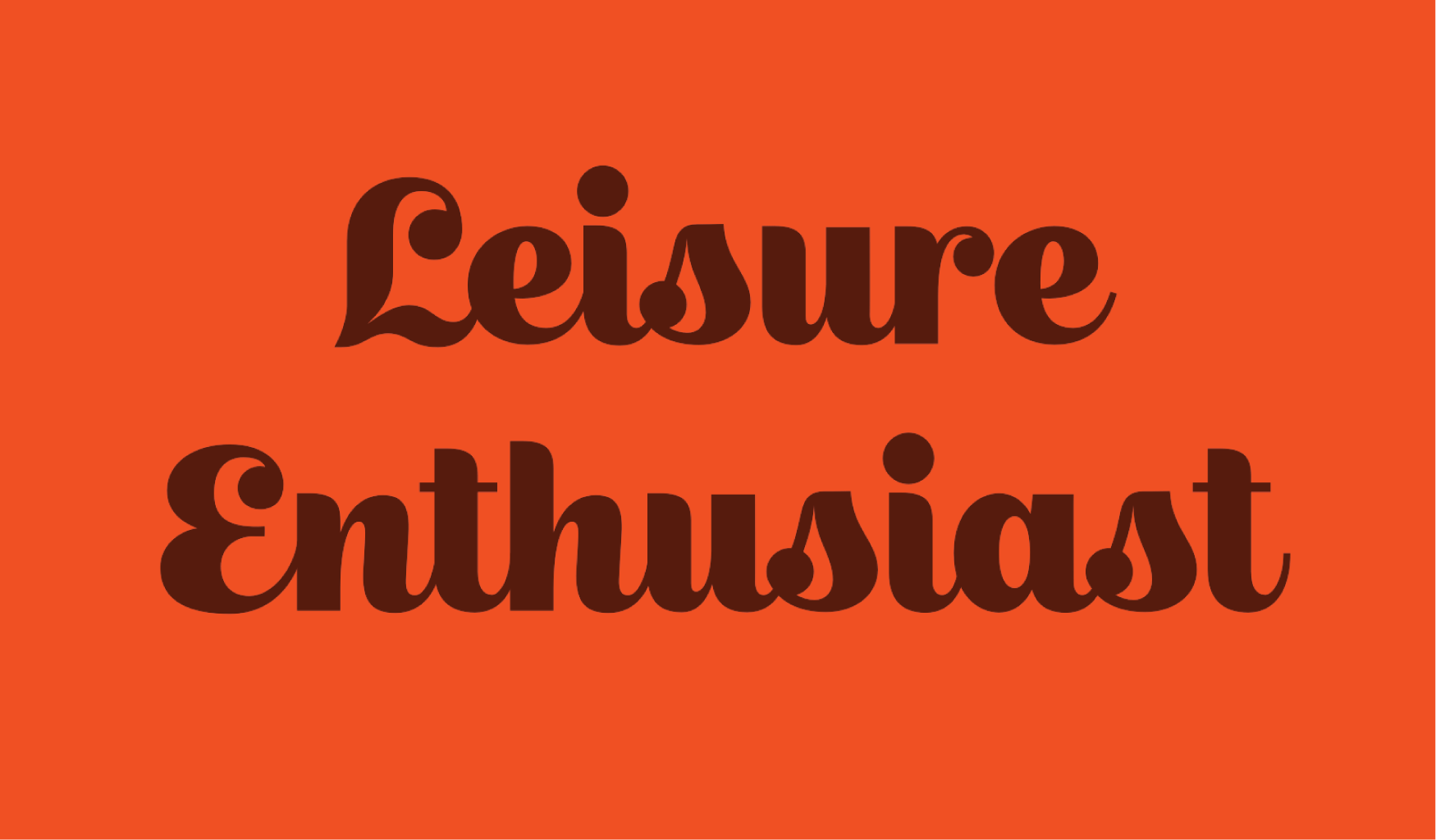
Leisure Enthusiast
This led to an initial piece of lettering I drew, and posted around on social media that said ‘Leisure Enthusiast’. This was created originally as an early draft of the type, and I had yet to visit some of the more complicated issues of its development. However it was inspiring, and the reaction from the design community seemed positive enough to justify it being completed.
With all of the goals of Escafina confirmed in my head, I realized this typeface was actually influenced quite a bit from my work as a graphic designer. Escafina would be practically a ‘logotype in a can’. A set-it-and-forget it way to make a competent upright script setting suitable for a logotype, with no manual intervention needed.
Thus I began solving the issues. Getting the most common groups of letter shapes (round characters, square characters and diagonal characters) to harmonize didn’t pose a particular challenge, and it was not dissimilar to other styles of type. Careful optical balances of these groups makes them feel they are harmonizing in the context of words, and with a script you have the added benefit of requiring relatively little kerning (as ideally these relationships solve themselves, so to speak, through the connections).
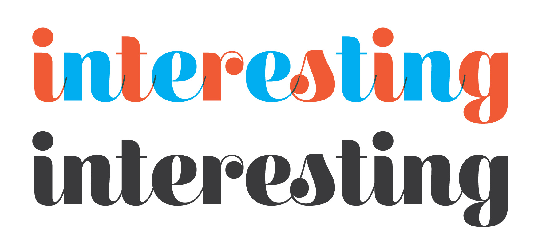
However Escafina’s parameters of letter construction began to provide some really interesting challenges, quite early on. As an example of the oddities the upright ‘structured’ script genre can produce, Escafina is perhaps the only typeface I will ever design wherein the ‘v’ and ‘b’ are amongst the most closely related drawings.
In addition to each group having an optical balance of spacing necessary to harmonize them, they each required a connection of some kind to the following glyph, and these needed to be drawn in a way that felt natural to the letter shape and anticipated every other group of letter and letter connection. This required a lot of trial and error, and ultimately I made the decision not to force connections. If, after many attempts to create a convincing, natural feeling connection, a letter was still putting up a struggle, I assumed this was a good indication that it didn’t need a connection at all. This is the case with the ‘o’ for instance, a shape in Escafina that looks like it could similarly belong in a sans or serif design.
This is where things get particularly tricky. Every script alphabet has a few glyphs that are (I will say, because they deserve nothing more eloquent or polite) a massive pain in the ass. Any type designer who has drawn a script typeface will agree, the source of many chewed pencils and torn out strands of hair are the ‘r’, ’s’ and ‘x’.
I could write an entire blog post purely about these glyphs, but let me just shorten this to say: I drew many many many variations of these. Some of which were discarded in a day, some stuck around for months in the development, only for me to realize they were truly awful and causing more problems than they were solving. At one point I literally redrew the entire alphabet purely because of the letter ‘x’, a chapter of this typefaces development that still brings a frustrated tear to my eye. But this is type design; this is the true puzzle that we sign up for, in making typefaces. Especially ones for which there is not a very well documented or agreed upon model of letter construction, like Escafina.

Next to the lowercase connection system, one of the larger chapters of exploration and iteration in the development of Escafina was the capital letters. Taking lettering as the inspiration, there were rarely many samples of capital letters, and even rarer to find any that agreed with each other very consistently. The beauty of lettering is that you can draw a cap that functions in a specific setting, but wouldn’t (or doesn’t need to) in the context of other caps, or with random lowercase letters. The few samples I could find of script typefaces with a somewhat upright axis seemed to subscribe to a model of construction that was completely wrong for Escafina. Some relied on angled stress, which Escafina did not incorporate. Some were more like Oblique serif caps, which didn’t fit in the world of Escafina at all. Some were more formal script caps, with details that were too fussy to be re-thought for the proportions of Escafina (rather bold, lower-contrast, and with relatively short caps for logo-type-esque word shapes).
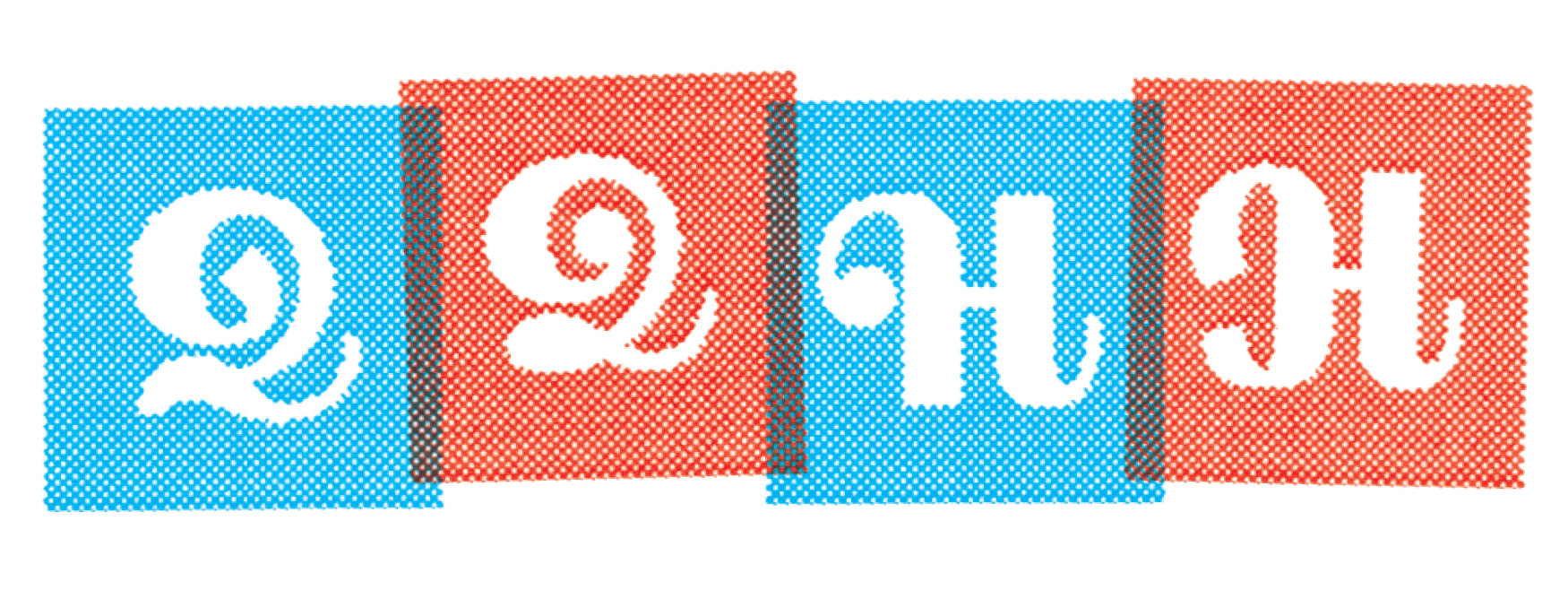
In the end I realized that the elements of proportion and functionality that were unique to Escafina would require that I synthesize a few different influences to create a unique model for the caps. I realized that 1970s swash caps (such as the ones drawn by the prolific Ed Benguiat for many seriffed faces) were roman (upright) but very elegant and characterful without being impractical. They also incorporated ball terminals, which are often featured in Escafina’s lowercase. Combining that influence with a more traditional script cap model (slanted backwards to become upright) provided caps that felt right for Escafina. The lack of serifs made them feel fresh and rationalized enough to belong with the lowercase, but the script influences allowed them to connect to lowercase letters in a cohesive way. As is the case in many typefaces, the ‘Q’ was a chance to have some fun, one which I took advantage of.
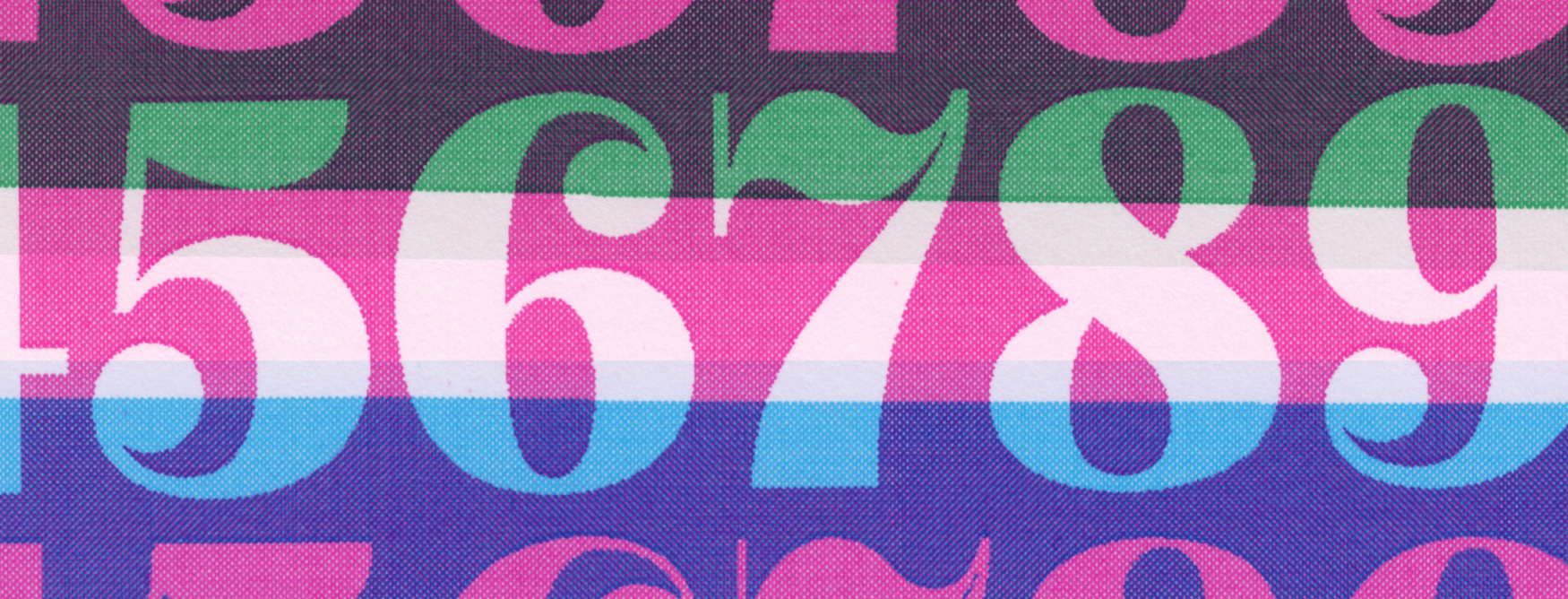
For the figures I chose modern-stress serif figures as the influence (removing a single serif on the 1, which looked out of place in Escafina’s serif-less world). The ball terminals present elsewhere were featured here, and they felt appropriately elegant and functional.
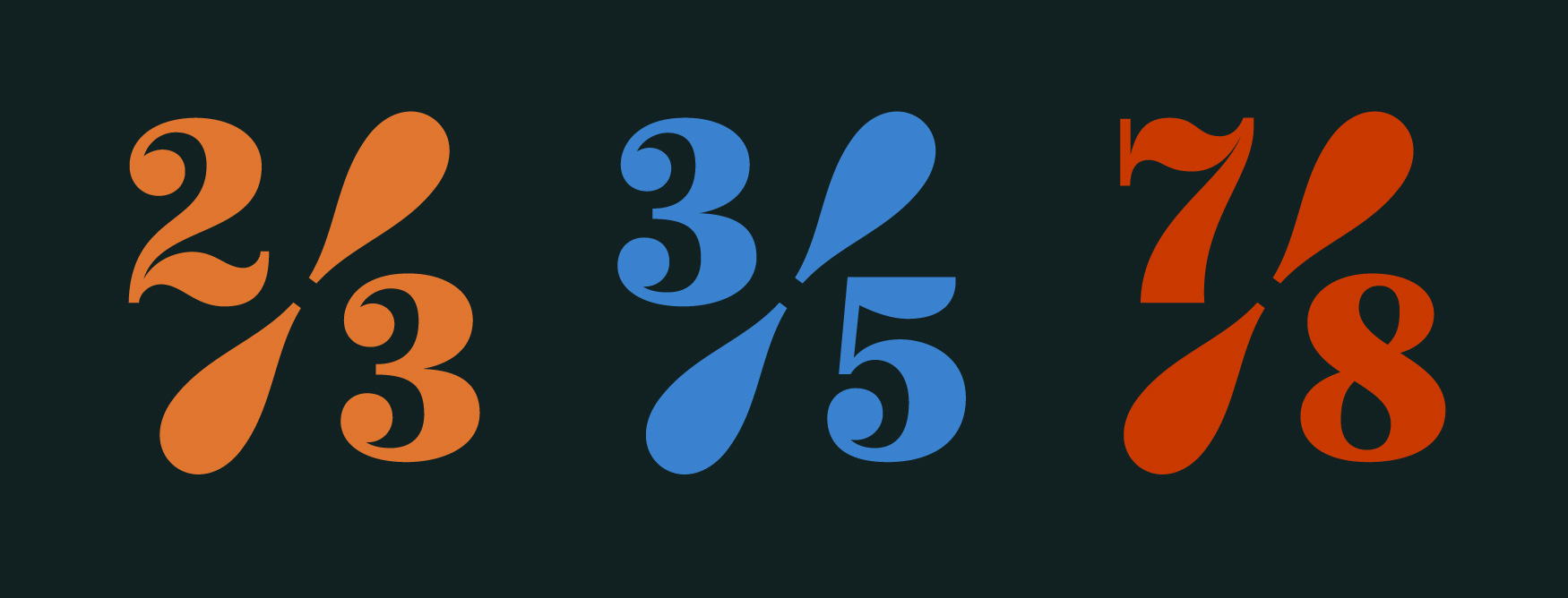
I also incorporated arbitrary fractions, with a split-bar construction that reflects some of the swelling geometry found elsewhere in the typeface.
It was while completing the caps, and thinking about the influence of serif swash caps, that I realized that much of the elegance I admired in that source of inspiration was coming from the ultra-thin hairlines in serif faces drawn for large sizes. Escafina was influenced initially by sign painting (where the brush often produces a lower contrast, more charmingly hardworking result), but could Escafina similarly convey elegance if the hairlines were thinner?
One trend I notice in my type design is that I often like to throw myself curve balls by expanding the scope of an idea to require adventures into new ways of thinking and drawing. With Escafina, after the idea was almost fully realized, I decided to redesign as a family of 3 styles, each with progressively thinner hairlines.
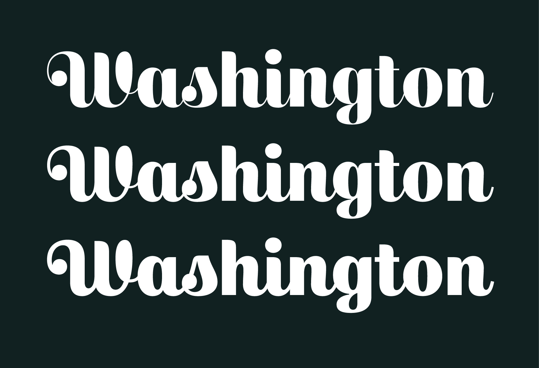
The original drawings would become the ‘low’ style, there would be a version with very thin (10 unit) hairlines, and a style in the middle would now function as the ‘medium’.
As part of this process, I realized that it would be a nice piece of functionality to allow typographers to set Escafina and switch between these styles without causing re-flow of text or changing the width of a word. This meant that all styles of Escafina would need to match perfectly in the width of letters, the spacing of letters and the kerning of letters. Because the low-contrast style had been designed first, this made it easier to match the versions with thinner hairlines to the original ‘low’ drawings, for which I wrote a robofont script in python to automatically ‘multiplex’ these styles.
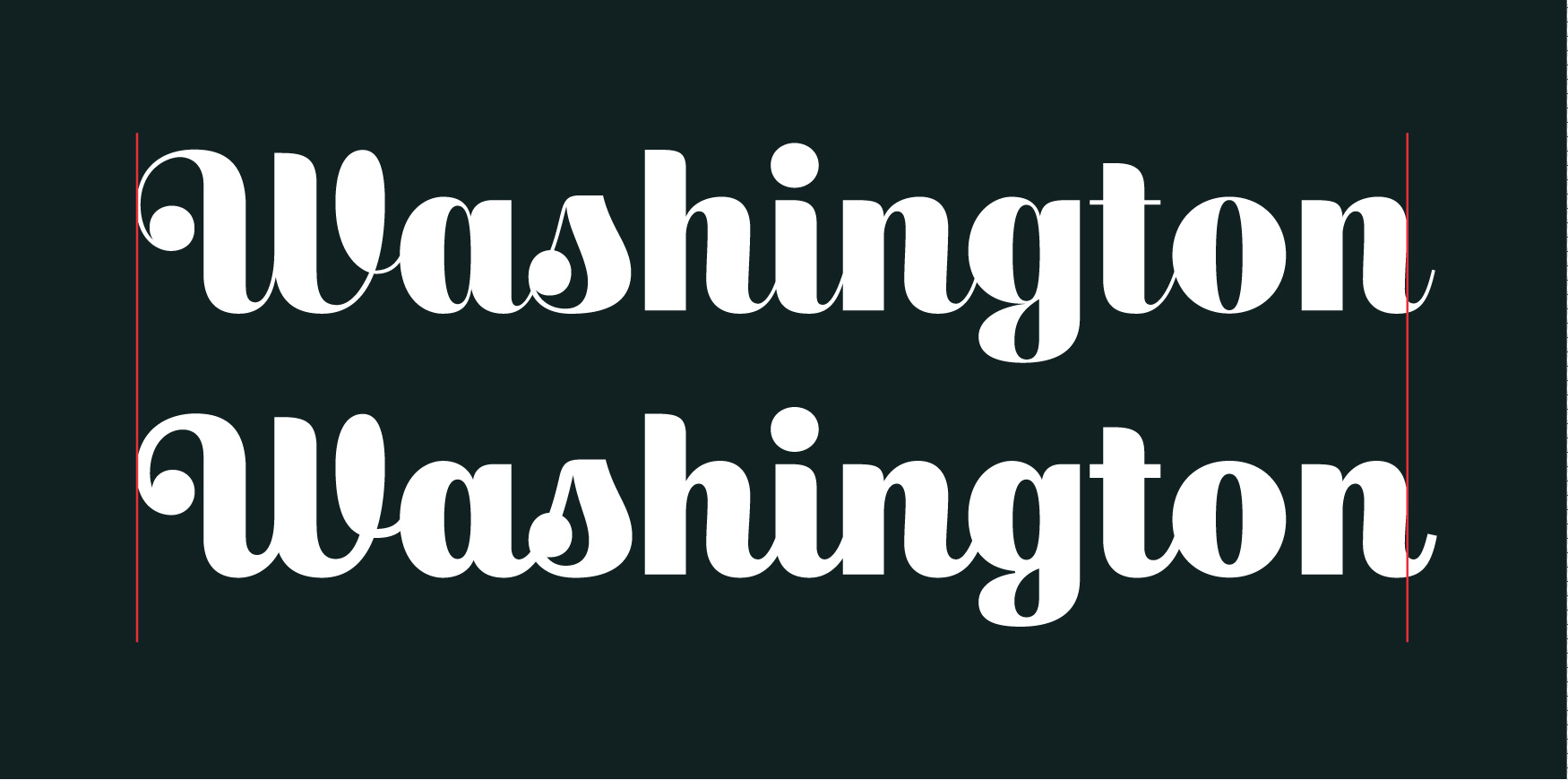
This feature could be used to ensure that Escafina renders nicely at a certain size on screen, or prints properly on certain equipment. It could also be used as a way to shift the aesthetic tone of the type from the sign painter low-contrast influence, to the serif-inspired high contrast ‘high’ variation.
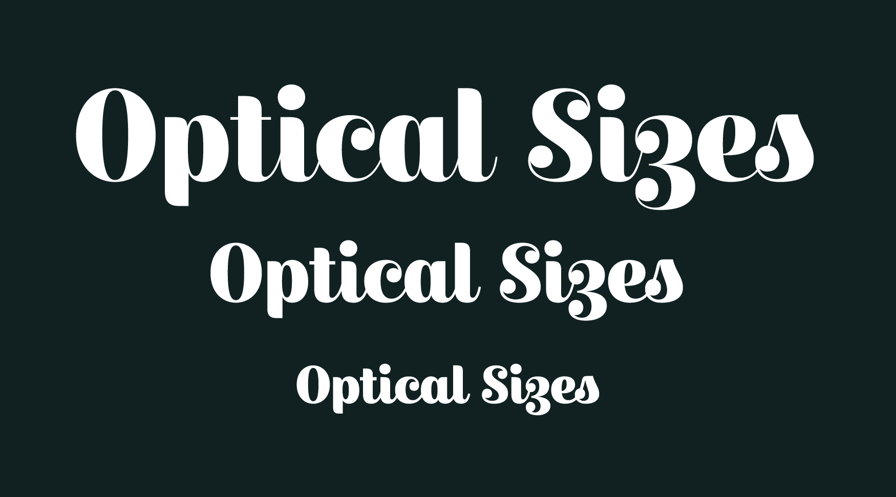
This drawing process allowed me to revisit the drawings in all styles, and harmonize them even further. To see what a letter would look like across all three levels of contrast gave me the perspective to make the correct adjustments to all three. Suddenly I felt my previous design process had been like designing one corner of something, ignoring the larger picture.
I learned a lesson here, about pushing ideas beyond your current understanding of their potential. When you have a chance to expand your idea to incorporate something new, it may provide perspective to make your original scope fundamentally better, in addition to increasing the value and functionality of the result. If you’re a designer (in any discipline) reading this, I challenge you to apply this thinking to your next project.
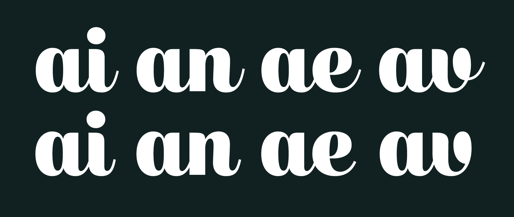
Once all the letters were working completely without OpenType, I realized that I could now confidently add OpenType features that supplemented the appearance of the fonts, instead of having the fonts rely on them to function. I added ‘final forms’, versions of the letters meant to work specifically at the end of words (shortening the connections on letters that aren't followed by another letter, to look more similar to how a human would draw them). And of course I added diacritic glyphs so that Escafina can be used in over 100 languages.
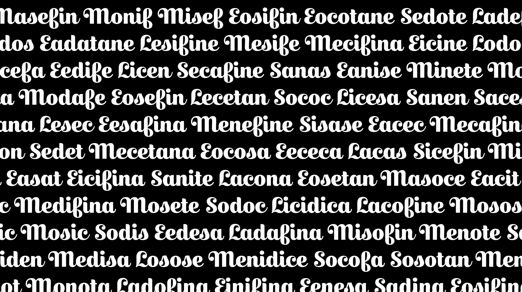
Up until this time I had been referring to this typeface (for years) as ‘Upright Script’ in my development files. I never sat down to name it until mere days before the launch, and I found it quite difficult to find a name. Often a typeface name is derived from the type designer’s favorite glyphs from the typeface, and this was the direction I chose. In the end I wrote a piece of software to quickly generate names based on letters and syllables that I liked, which would then typeset the name in the font for testing. I handed a sheet of several hundred options to my girlfriend Heather, who chose ‘Escafina’. It sounds simultaneously spanish and italian, but it is in fact a nonsense word.
For the release of Escafina I worked with Kenneth Ormandy once again, who had previously designed the mini-site for my typeface Moriston. He came up with clever ways of showing the various features of Escafina (including its grade/optical size feature). I had drawn so many annotations on proofs of Escafina that I thought it might be neat to have the actual type-tester on the site provide similar notes about the features of the individual letters. Kenneth implemented this idea deftly, and in the end I (for some reason) drew over a dozen pages of tiny notations, trying to find ones where I approved of my own handwriting (but that’s a story for another time).
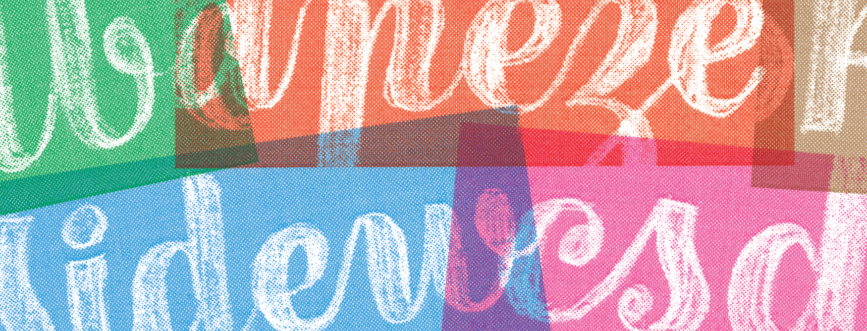
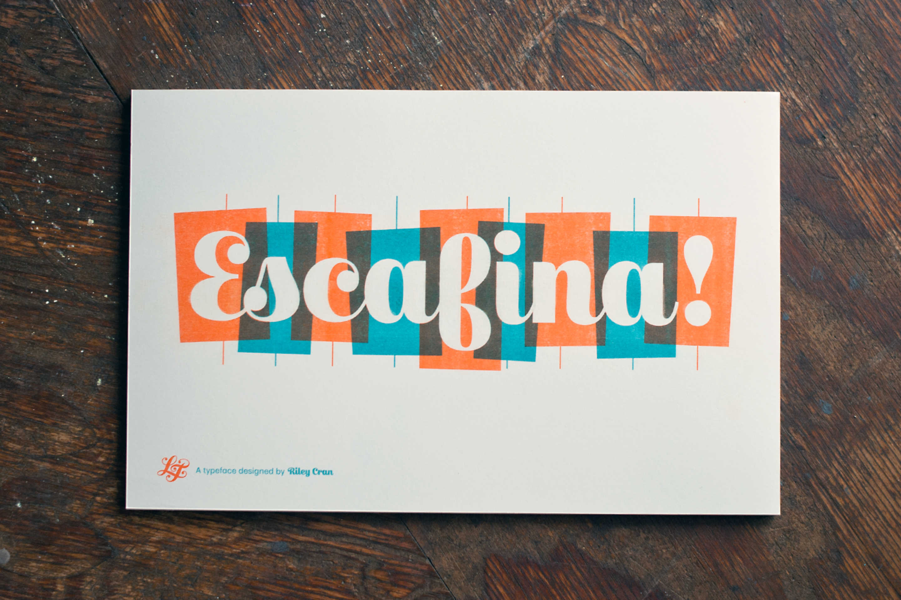
I also designed a risograph print to be sent out to anyone who purchased the commercial license. For the print I wanted to make something that was inspired in some way by the idea that the flowing words of Escafina were created by placing each letter in a rigid box.
The ‘type work wednesday’ meetings have since changed days of the week many times, and are now more of a ‘type work most mornings of the week’. The type designers I had met are now some of my closest local friends, Alanna Munro, Cody Jones and Kenneth Ormandy, all of whom work on Lost Type projects.
Escafina was a true challenge to create something that felt comfortable without a practical historical model. It was liberating to solve the puzzles that it presented, and it gave me a new level of confidence to break the mold more often in my type design work, and to seriously respect the role of research in this process.
Thanks for taking the time to read this, and make sure to check out the mini-site, designed and developed by Kenneth, with contributions by Dan Gneiding and Danelle Cheney!
