Often times when you know someone on the internet, no matter for how long, meeting them in person for the first time is full of anticipation. A hope that they will be the person you imagine them to be. When I met Dan Gneiding in person for the first time on a June San Francisco morning in 2012, after digitally collaborating with him online for over a year, it was in a room filled with Lost Type contributors from around the world. We shook hands, and exchanged pleasantries, but the first thing I remember him saying to me as he reached into his bag and produced eight 13×19 proofs of his new typeface, was “Oh I wanted to show you this. I’m sorry I only had time to finish 8 of these. My Dad had a stroke last night, but he’s tough as nails, and he’s ok.” It was at that moment that I realized that Dan Gneiding was as dedicated and prolific a person as I had come to assume that he was.
What I couldn’t assume at the time, was that these proofs would lead to over 2 years of development on a family of reverse contrast faces that (to my knowledge) rivals any other single reverse contrast family currently available in digital font form.
I didn’t realize that on the mornings when I woke up at the San Francisco Field Trip to head upstairs and meet everyone else for the day, that Dan would already be awake, throwing bezier curves around, fully dressed on the couch he had volunteered to sleep on. I didn’t realize that the scope of the project would later involve scouring through cases of wood type in Brooklyn, having my hand photographed as I posed it under my desk lamp, hand painted signs above my fireplace in my apartment, crying over first screenings of a stop motion animated film or flipping through the pages of a hard cover specimen book. And I did not realize that my jesting suggestion to call this project “Dude” would be taken so seriously. Dan blew me away on this project, and I was honored to watch it all happen. His most unique skill (in type design and his graphic design work) seems to be the ability to take a novelty and create something that makes you question your preconceived notions. Below, Dan has cataloged some of the landmarks of this process. Take it away, Dan!
March 2012. The internet.
Me: “I want to make a cowboy font.”
Riley: “You should call it Dude.”
…and so the first steps down this long dusty trail began.
The history of American Wood Type offers a rich and eclectic range of styles. Blackletter, two toned circus type, exaggerated tuscans and of course all manor of Egyptian Slabs. One can’t very well make a “cowboy” font with out drinking in some serious whiskey and wood type research. If you are lucky enough to be near Two Rivers Wisconsin, the Hamilton Wood Type Museum is a wood type mecca. If you are not stopping by Wisconsin anytime soon, Rob Roy Kelly’s History of American Wood Type is a great primer.
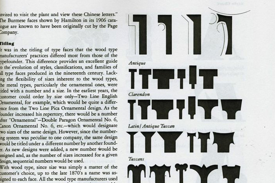
Some of the most extreme letterforms ever created were designed and carved in wood in America in the 1800s. Absurdly Condensed to ultra wide faces, crudely drawn sans to intricately carved drop caps, there is no shortage of inspiration here. When it comes to that wild west feel though, nothing can top a good’ol reverse contrast slab serif.
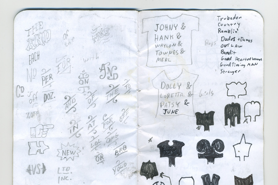
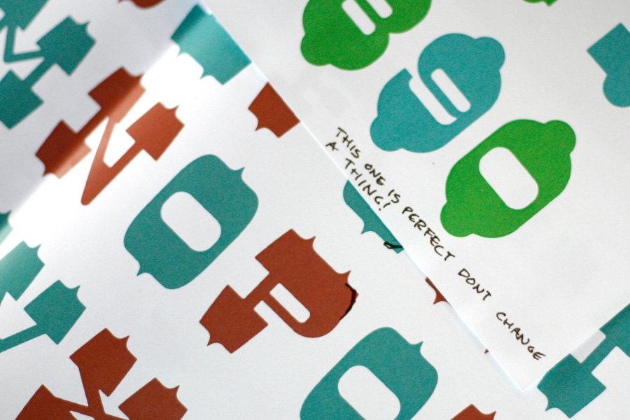
I started sketching and the basic concept of Dude began to emerge, a family where the shift is not in weight or width, but in the styling of the serifs.
A key landmark in the progress of the Dude family was the Lost Type inaugural Field Trip to San Francisco. Getting the input of several members of the LT team was a huge leap forward in the evolution of Dude. I can’t thank all those folks enough for their feedback.
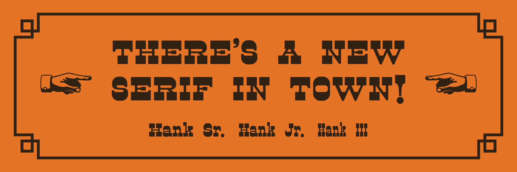
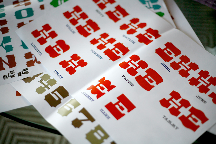
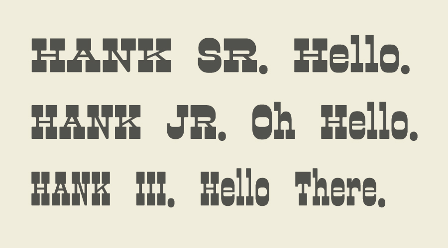
When all was said and done Dude ended up with 12 distinct serif styles, each named after a country music legend. One is called Dolly- for its voluptuous serif implants.
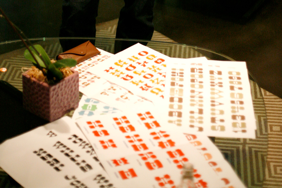
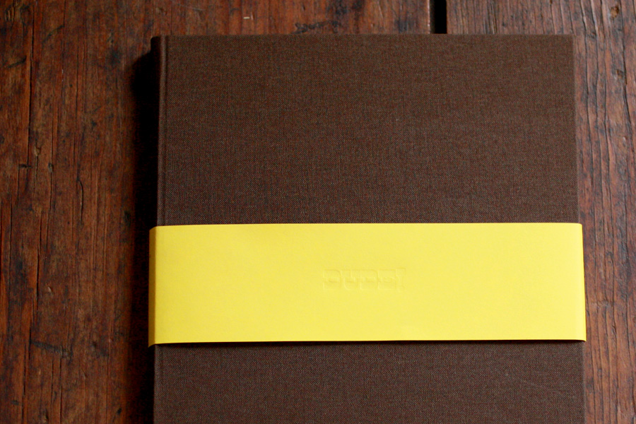
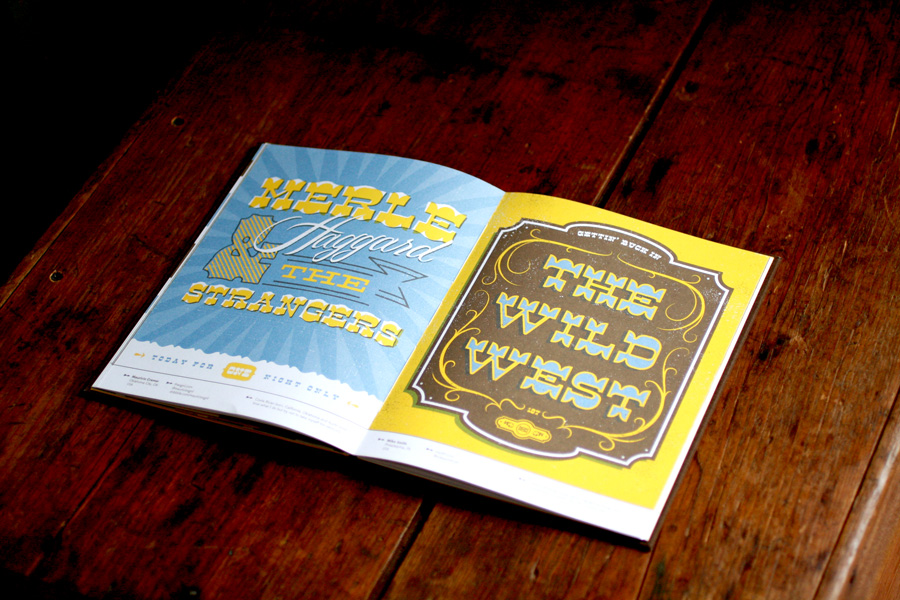
The Dude specimen book is printed offset in three colors and casebound with a brown cotton linen hard cover. It features the work of some of Lost Type’s favorite designers: Jesse Southerland, Steve Decusatis, Chaun Osburn, Greg Christman, James Edmondson, Teresa Wozniak, Beggers & Thieves, Patrick Macomber, Mauricio Cremer, Mike Smith, Oh! Revior, Justin Mezzell, Eight Hour Day, Jenny Tondera, Jim Liszczynski, Julie Frey, Neuarmy, Trevor Baum, Linda Eliasen, Heads of State, Tim Gough, Jeremy Dean, Emir Ayouni, Rick Murphy, Ted Guerrero and Riley Cran. This specimen book comes free with every commercial license purchase of Dude.
Colt Bowden’s promo video for Dude is delightful combination of traditional sign painting captured through time lapse photography and stop motion animation.
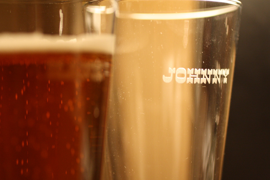
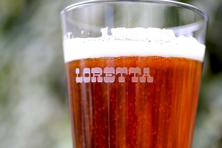
My father in law came through with the perfect gift for me with this set of etched beer glasses featuring all the Dude styles!
You would think a 12 style reverse contrast family would satisfy the completist in even the most die hard cowboy wood type enthusiast. But I felt like there was more that could be done. Any wood type printer worth his boots would have a drawer full of catchwords, borders, ornaments and other goodies.
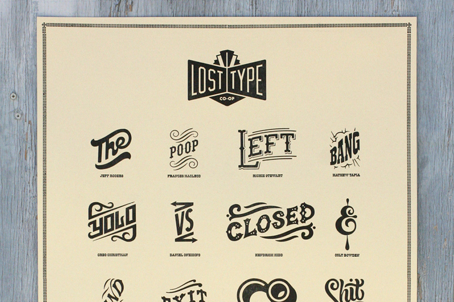
The Lost Type Field trip to San Francisco started the wagon wheels turning on an expansion set for Dude. We rounded up a posse of our favorite letterering artists and type designers to contribute some catch words that would compliment the existing Dude styles. Contributors include Richard Stewart, Justin Mezzell, Ryan Hamrick, Michael Spitz, Jeff Rogers, Frances MacLeod, Matthew Tapia, Greg Christman, Kendrick Kidd, Colt J. Bowden, Tymn Armstrong, Patrick Macomber, Joel Evey, Ryan Kartina, Sean Gallagher and Riley Cran.
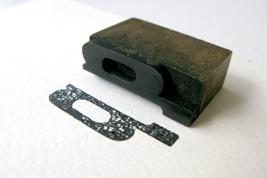
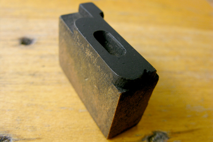
The catchword set was finishing up nicely right as the next annual Lost Type field trip got underway. That’s when Riley found this gem of a letterpress sort at the Brooklyn Flea, just down the road from where we were staying. If Dude had a lower case set—this would be it… So it was back to the drawing board to add condensed and compressed versions of Dude’s Hank style with a full lowercase.
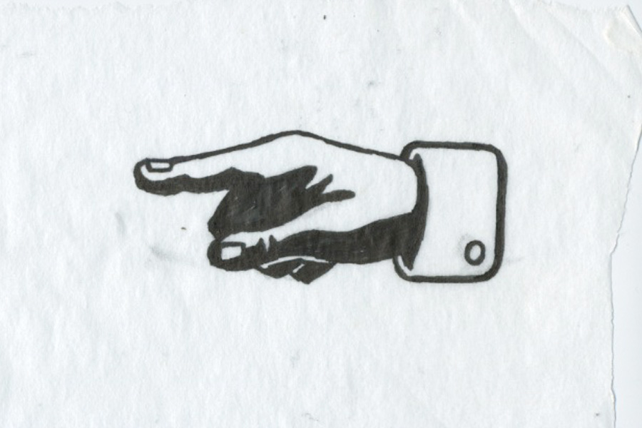
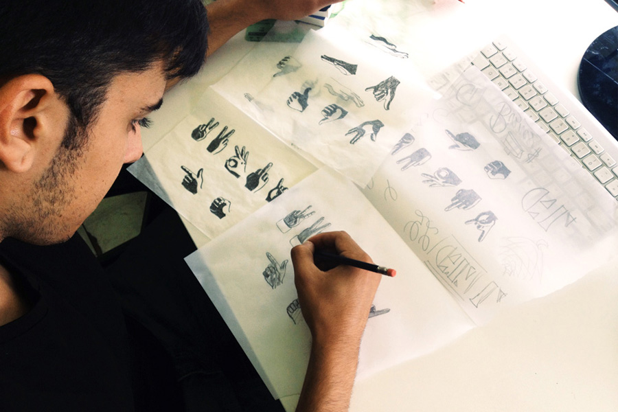
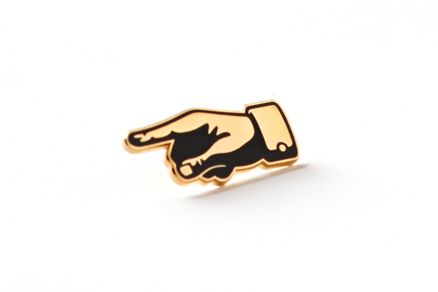
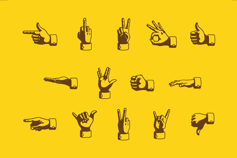
No wood type collection is complete without a set of Manicules. Cade Cran drew up a stellar set of manicules that goes well beyond the traditional pointing hand. Cade’s pointing Manicule pin is available in the Lost Type store!
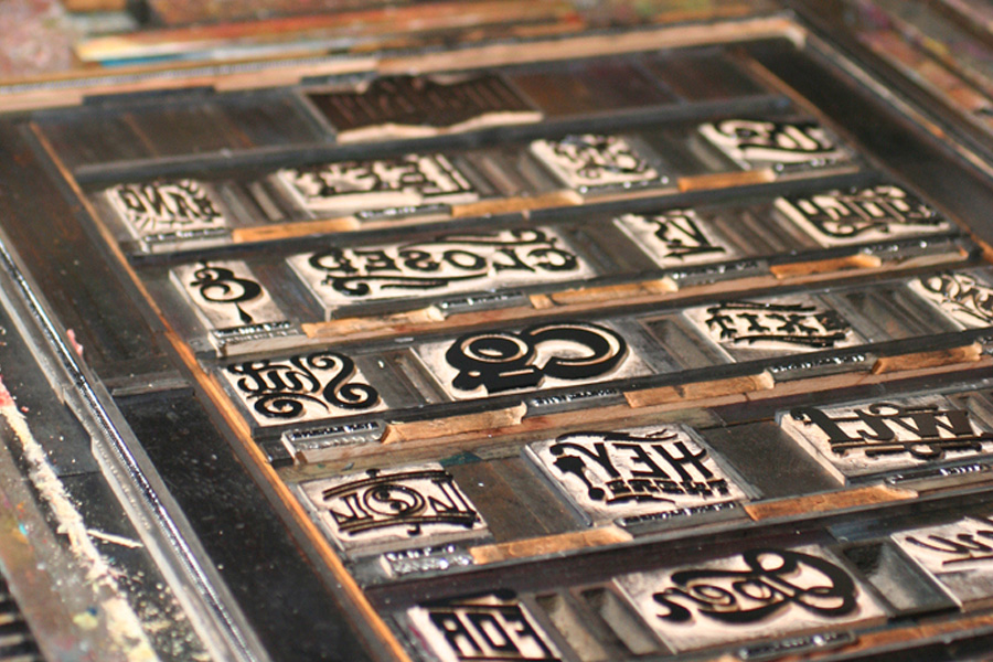
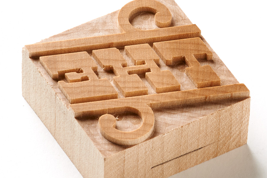
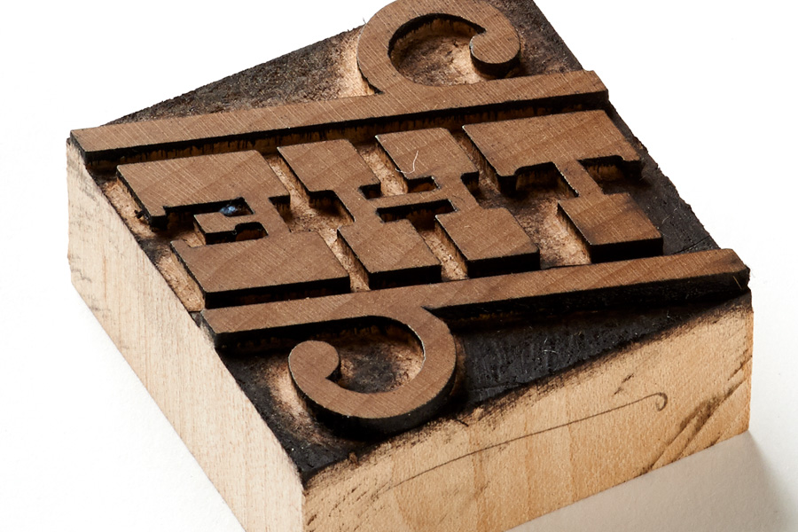
For good measure and posterity, we thought we’d bring Dude all the way back around to the original inspiration and get it cut in wood. We got in touch with Scott Moore of Moore Wood Type and a select few of our catch words were cut as real wood type blocks!
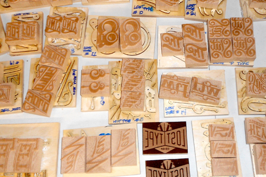
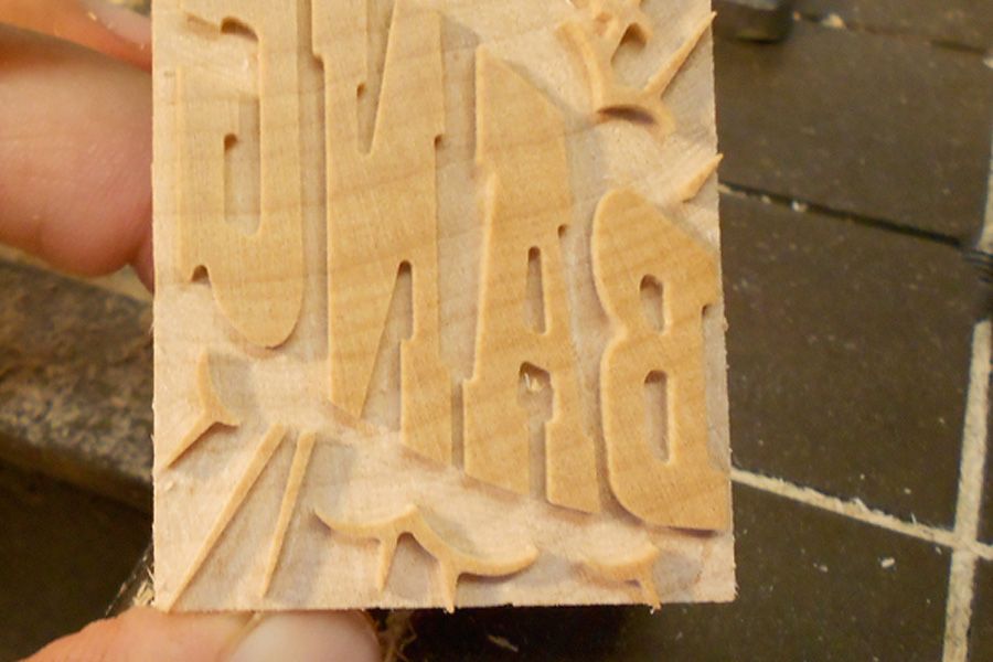
The Blocks were then shipped over to Starshaped Press in Chicago, where Jen locked ‘em up, wood and ink hit sheets of French Paper™, and Dude returned to the medium that inspired the whole project! (Jen wrote a wonderful, detailed post about the printing process on the Starshaped blog). This poster comes free with every commercial license purchase of Hank Pro.
And so Dude gallops off towards the setting sun. I had a hell of a good time working on this and it was an honor collaborating with so many fine folks. See y’all further down the trail!
The 12 original styles of Dude can be purchased here. The newcomer, Hank Pro, (featuring 3 widths, 14 manicules, and over a dozen catchwords) is available here.