This is the first post in an ongoing series by various Lost Type contributors. Jon Ashcroft is a creative director and illustrator based out of Phoenix, AZ.
I never had aspirations to be a collector of any sorts and certainly never planned on acquiring numerous clunky-old-beaten-up cameras. However my background in fine-arts photography paired with my love of old things quickly drew my attention to the image capturing devices of years past and a mild obsession was born.
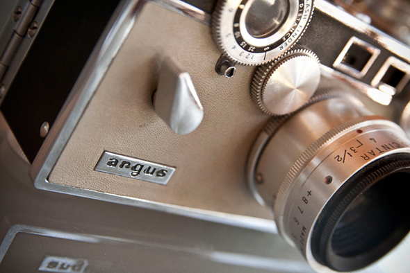
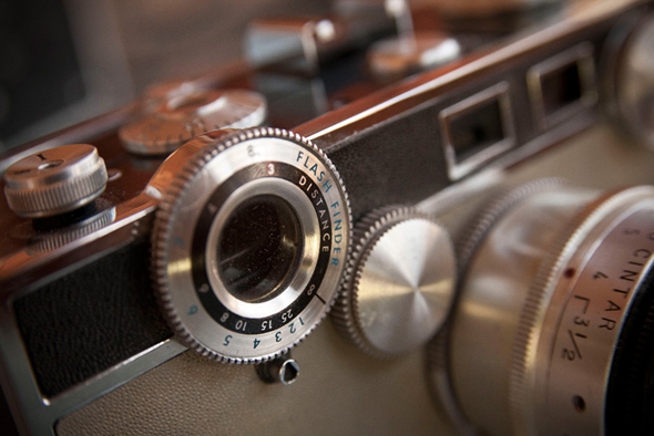
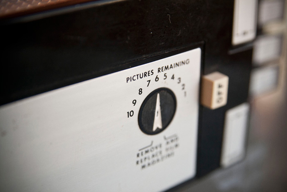
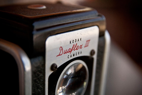
My attraction to vintage cameras is concerned more with the aesthetics and design of them rather than any notions of using the dated technology. I love the metal knobs, awkward shutter releases, pressed number plates and various focus rings but most of all I love the type.
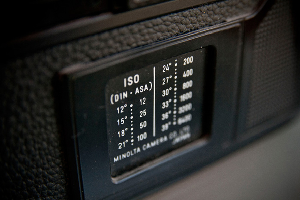
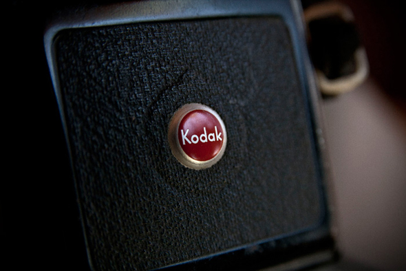
Taking pictures with these monstrosities was a complex process that required the user to adjust a number of functions in order to get the desired outcome. All those complex adjustments meant a great deal of information had to be present on the cameras and thus we have a typographic gold mine. Etched exposure knobs, aperture rings, film speed suggestions, canister loading instructions and of course the manufacturers logo mark.
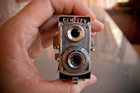
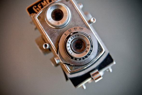
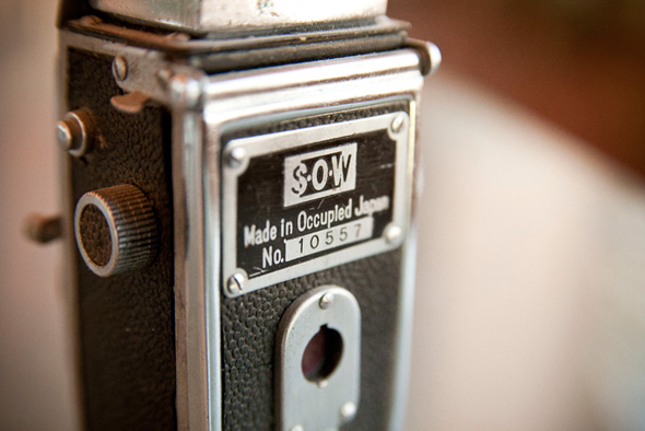
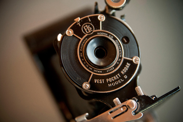
Here is a small sampling of some typographic gems from my collection. I hope you find them as inspiring as I do.
