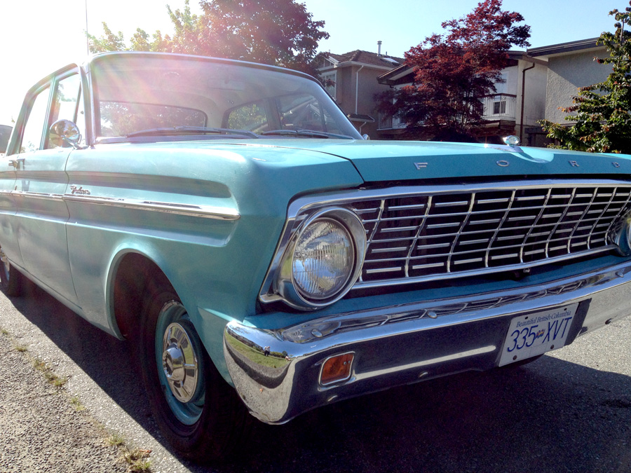
I just recently purchased a new car, a 1964 Ford Falcon. After owning the car for a short time now, I’ve noticed lots of cool little typographical nuggets in and outside of this awesome new old ride. Here are some shots I took of all of the cool stuff we found.
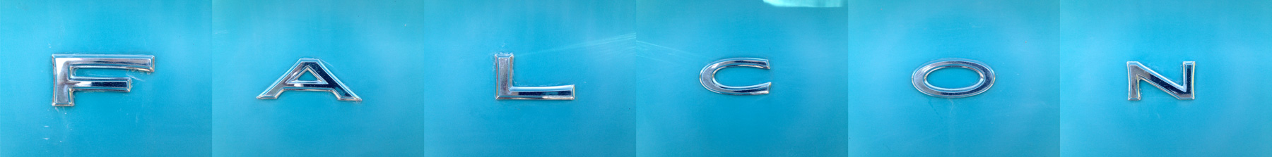
I love that Ford put enough thought into designing this car that they used three different styles of sans for “Falcon”.
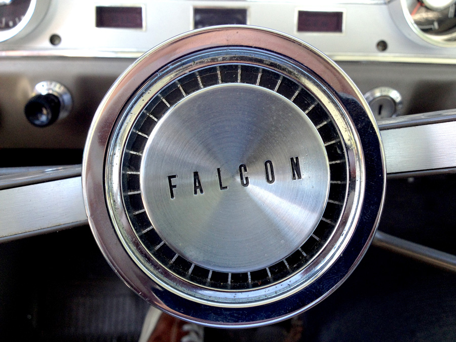
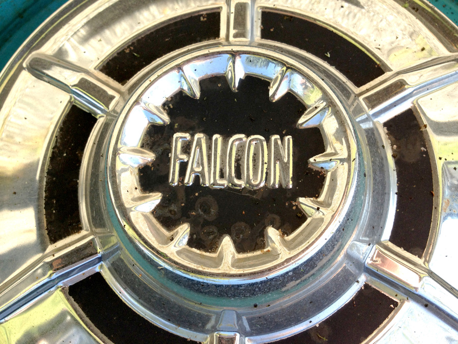
Steering wheel and Hub Cap. Photo Credit: Cade Cran
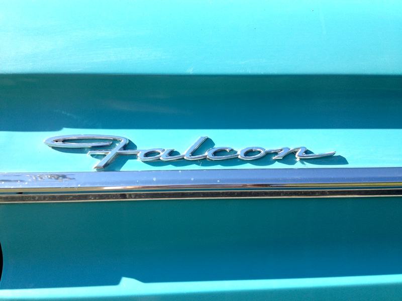
The main script chrome. Photo Credit: Cade Cran
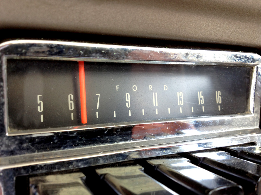
Radio numerals. Peculiar 5. Photo Credit: Cade Cran
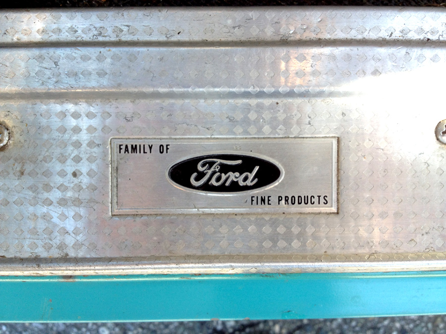
A family business. Photo Credit: Cade Cran
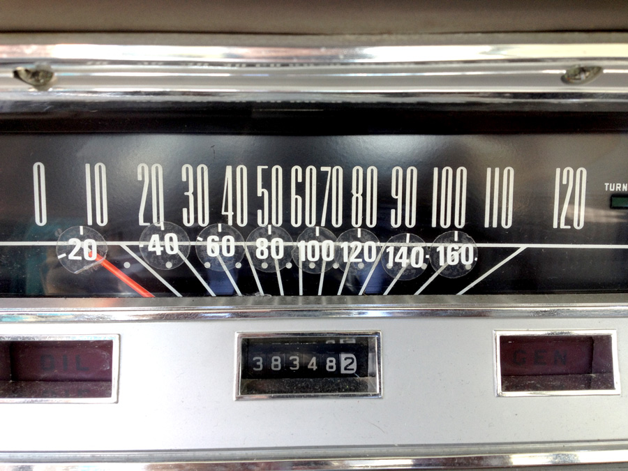
Speedometer numerals. Similar to the radio, but more condensed/compressed. Photo Credit: Cade Cran
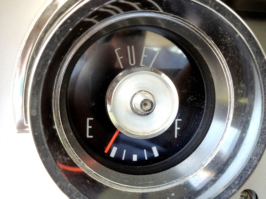
Fuel Gauge. Photo Credit: Cade Cran
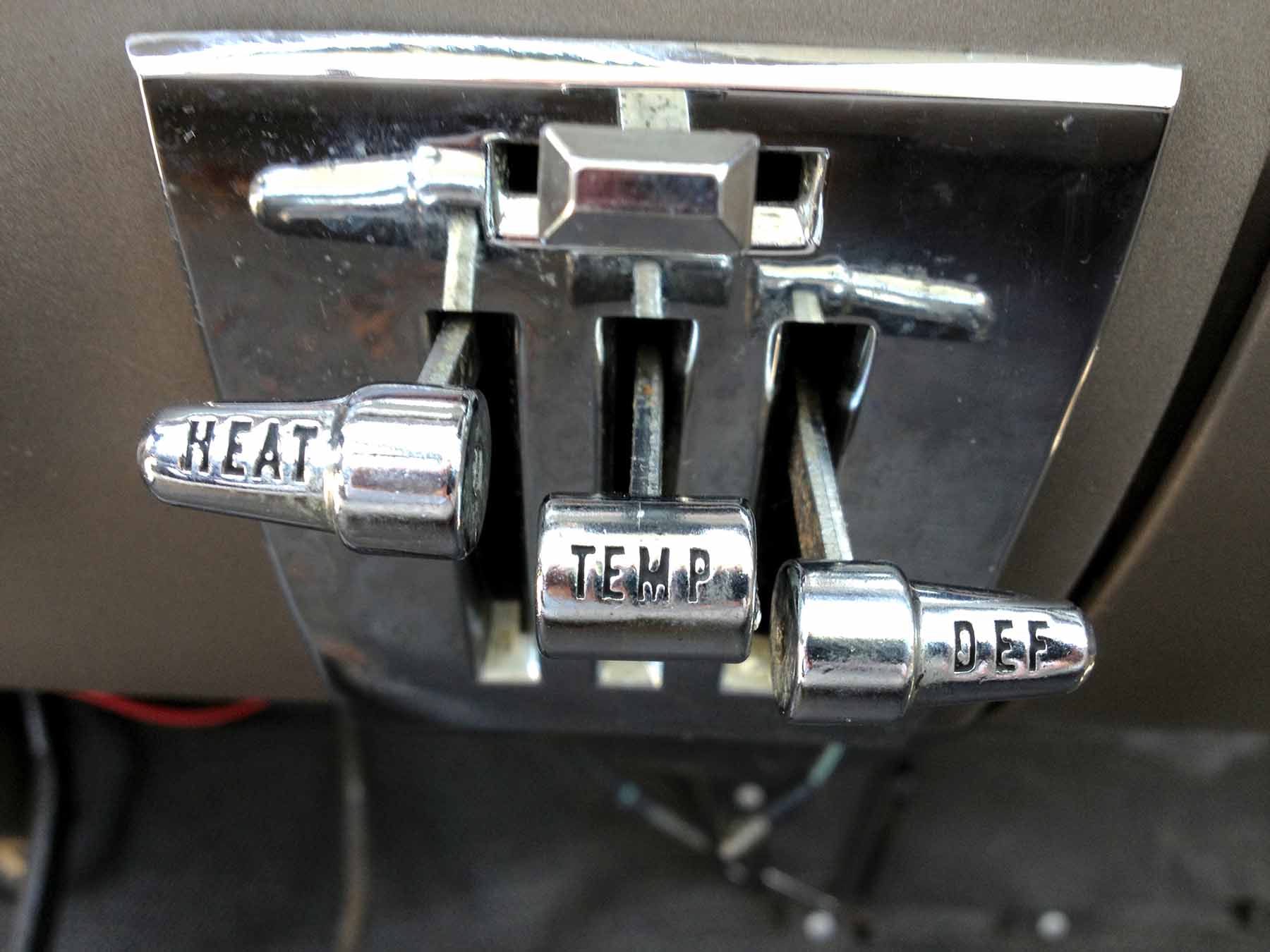
Heat controls. Photo Credit: Cade Cran
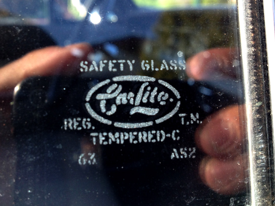
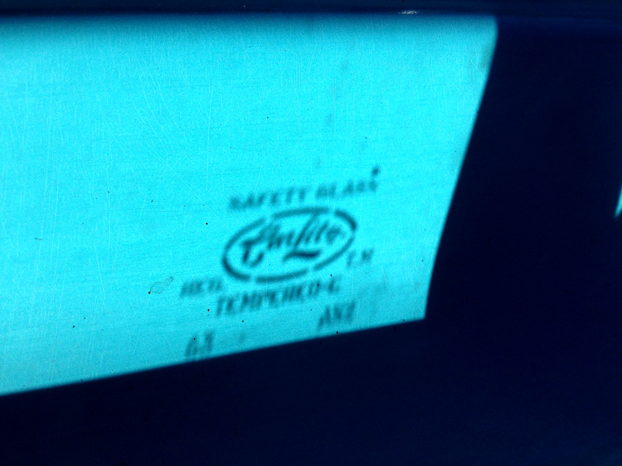
Even the window glass company logotype is great. Photo Credit: Cade Cran
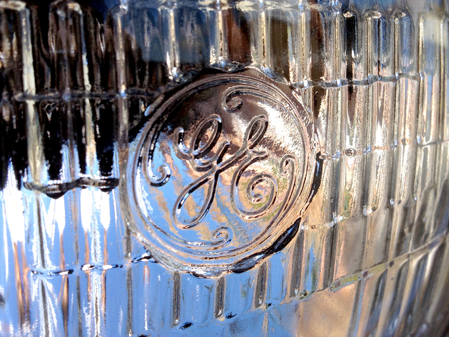
And as if that wasn’t enough, the right headlight has the GE logotype on it. Photo Credit: Cade Cran