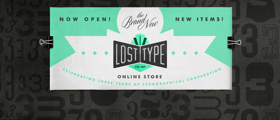
Years ago, when we first put up a store to sell physical items on our site, I asked my talented pal Aaron Scamihorn if he was up for drawing a banner image. And he took it literally! He put together a killer illustrated banner and put some of our fonts to use.
Recently when it came time to celebrate the launch of our latest store design and some new products, I thought back to Aaron’s original banner, and asked him if he’d consider doing another as a nod. I am really pleased that Aaron was around to design these several years apart, and I love what he cooked up.
Head on over to the store and check out some of our latest products, the Manicule Pin and our illustrated poster by Scotty Reifsnyder.
Below you’ll see the current banner, the original banner, and a tiled pattern of 3’s found in our fonts, to celebrate Lost Type turning 3 years old.


